
When I joined Third Space Learning (TSL) as the UX Designer on a dedicated product squad, the core challenge was already defined: teachers weren't seeing enough value in the online tuition platform, causing retention risks for the business.
My squad was just myself and my PM. We were responsible for the teacher experience, specifically the reporting side. I worked alongside two other designers in different squads, each focused on separate parts of the larger ecosystem.
The platform was functional, but a messy overload of data. It was confusing, difficult to navigate, and practically useless for a time-pressed teacher.
My role was to cut through that noise and design a reporting experience that made all that data actually valuable.
Discovery: What does Impact Really Mean?
Auditing the Scene
First, I needed to understand what world the platform lived in and what we were actually offering our users.
Internal Data Inventory: I cataloged every data point the platform showed teachers. The goal was simple: what information did we actually give them, and was it presented usefully?
Competitor Analysis: I reviewed industry standards for progress reporting. This showed what kind of data and features teachers typically expected from similar tools.
This audit confirmed our suspicion: we had data, but not clarity. Our platform showed numbers and lists, while competitors focused on insights and actionable summaries. This gap became our starting point for redefining the entire reporting experience.

Understanding the Stakeholders
We started with two assumptions about our primary users:
Class Teachers: Would be the daily users, deeply engaged with the platform.
Headteachers: Would be occasional users, checking high-level summaries.
I conducted in-depth interviews with over 40 educators to validate this. The findings flipped our assumptions completely:
Headteachers were the active data drivers. They needed detailed as well as, presentable data to prove ROI and senior leadership.
Class Teachers needed quick, actionable guidance, not deep exploration. They relied on surface insights, mirroring a tutor's live feedback: what a student struggled with, and most importantly what to do next.
Everyone defined impact by clarity and the ability to act. The old platform gave them data, but not the understanding or tools to create change.
This was the pivotal insight: the platform had to support a critical feedback loop. Headteachers needed clear evidence to justify the program's funding to SLT and actionable insights to feedback to their teachers. Teachers, in turn, needed to see exactly where a student was struggling to take immediate action, whether that meant swapping them out or focusing on a topic. The platform had to serve both roles to make the intervention sustainable.

Data that Shows Impact
The platform collected lots of data, but what did teachers actually find useful? To move beyond our assumptions, I ran card sorting exercises with educators:
Open Sorting: Teachers grouped data points based on what they felt belonged together.
Closed Sorting: Teachers sorted the same points into the new categories we defined.
The outcome was a clear blueprint: we learned which data clusters teachers valued (forming the basis for new reports) and which labels caused friction. This exercise didn't just reorganise menus, it redefined the reporting content itself, ensuring every metric we presented was tied to a teacher's definition of impact.
Ideation: How Can We Surface Impact?
Crafting Scenarios & Mapping the Journey
I created “How Might We” questions and user stories to translate teacher needs into specific design challenges. This process directly shaped the reporting framework:
The “How Might We” questions pinpointed the relevant data points needed to answer each challenge.
The user stories confirmed the type and scope of reporting required, revealing we needed at least two levels: a grouped view for the whole class and an individual view for each pupil.
To ensure these concepts worked in practice, I then mapped the entire intervention journey. This revealed the critical moments where those data points and reporting levels could surface to replicate or enhance real-world tutoring touch points.

Structuring the Flow & Wireframing
With the content and scenarios defined, I designed the new reporting architecture in tandem with other squads, ensuring it integrated cleanly into the platform's shared navigation bar. This coordination was essential to maintain a consistent, unified experience as teachers moved between all parts of the platform.
Within this structure, I developed wireframes for three core reports:
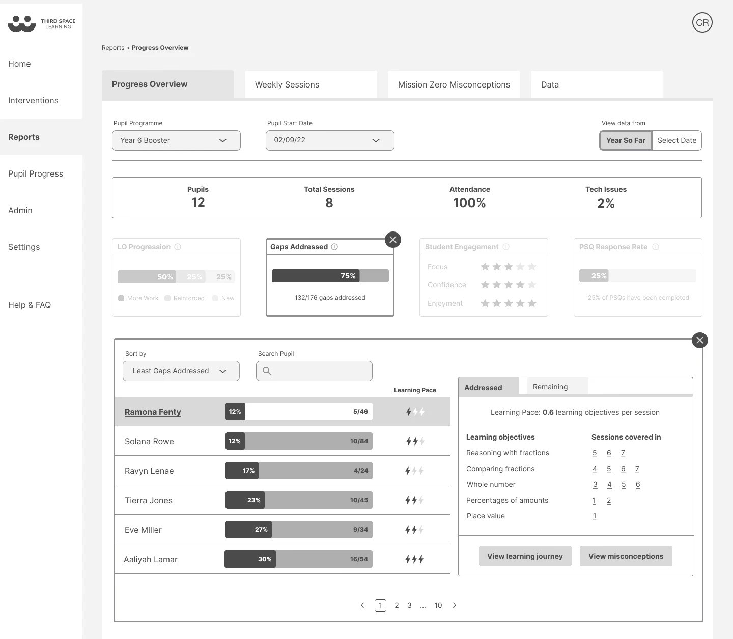
Progress Overview (featured below): A high-level dashboard for student progress overtime and long-term trends.
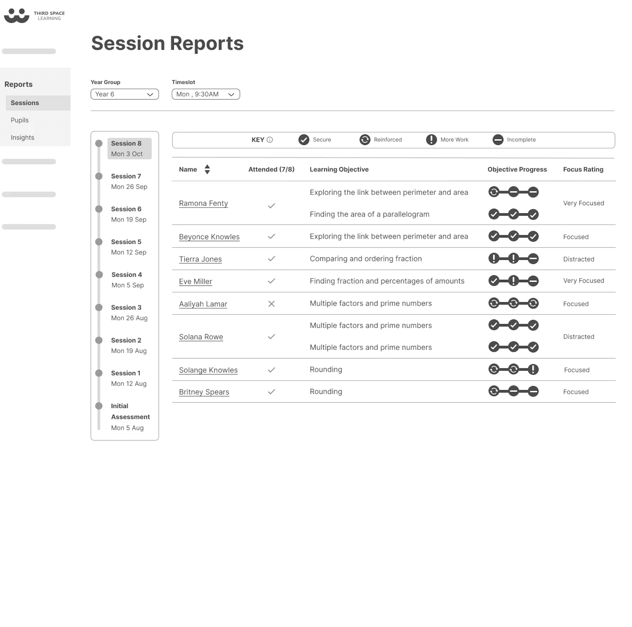
Weekly Overview: A focused report on recent group session performance.
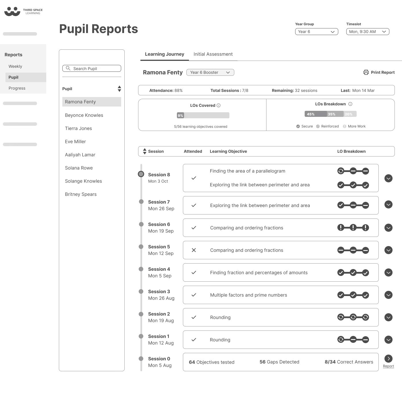
Learning Journey: A detailed, pupil-level timeline for actionable guidance.
Validation: How Impactful Is This?
Testing the Design
We tested the wireframes with teachers to see if the new structure and reports were clear.
The overall response was positive, but the tests revealed a specific, crucial flaw: the terminology was confusing. For example, the label 'Gaps Addressed' was unclear without explanation.
This insight was vital. It proved the information architecture and report format worked, but the language did not. We used this feedback to refine labels and ensure the design communicated with the clarity teachers needed.
The MVP Pivot:
Faced with developer constraints and initial data limitations, we made a strategic prioritisation. The 'Progress Overview' report relied on longitudinal data that simply wouldn't exist at launch, risking an empty and discouraging experience.
We pivoted the MVP to launch 'Session Reports' and 'Learning Journey' first. These features delivered immediate, high-impact clarity with the data available, directly addressing the core teacher need for actionable insights. The 'Progress Overview' was planned for a future update once meaningful data had accrued.
This decision ensured the release was both feasible and valuable, staying true to the user needs our research had identified.
My work laid the foundation for what shipped. While I transitioned off before the final build, the user research, information architecture, and wireframes I created were used as the blueprint by the team that implemented it.
This resulted in two key outcomes:
1. Direct Implementation
The 'Session Reports' and 'Learning Journey' features were successfully built from the wireframes and research I delivered.
I resolved core usability issues, redesigning reporting interfaces to be intuitive and clarifying terminology based on testing feedback.
I strategically prioritised these high-impact features within tight constraints, ensuring the MVP delivered immediate value.
2. Lasting Strategic Influence
A designer on the implementation team later reflected on the work’s role:
“What we ended up building has elements of what you had in your initial wireframes… Your user research helped us understand what to prioritise. You paved the way.”
The work provided a clear, user-centered direction. It organised the information, set the priorities, and gave the team a solid model to build from; proving that a strong UX foundation enables execution, even after the initial designer has moved on.
This project taught me to not be rigid with assumptions and let the data speak. Our initial ideas about how teachers and headteachers used the platform were completely wrong. Letting the research flip those assumptions was what made the final solution actually work.
I really enjoyed the ownership I had in my squad and take pride in the foundation we built. The fact that the team used our research and wireframes to ship the final features, and even adopted some of the research methods afterwards, shows that good UX work sticks around, even if you're not the one to see it through to the very end.
© UX Asha 2026