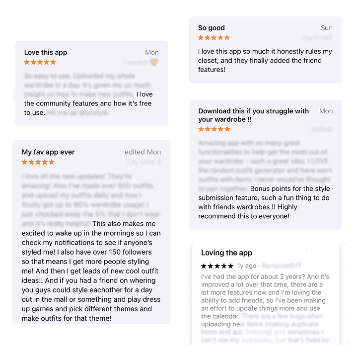
Whering’s mission to digitally manage your wardrobe resonated instantly, with 20,000 downloads in its first month. Five years later, that user base has grown to over 5 million users.
This growth was powered by the product, but the redesigned app became key to enabling retention and engagement, by making the platform easier and more engaging to use.
In 2022, I joined as UX Lead for a 13-month project to address retention and enable growth by restructuring the core app and introducing a social experience.
This project covers two phases:
Core UX redesign – solving structural usability issues.
Social features – enabling safe, fashion-focused community engagement.
Discovery: Why were users leaving?
Analysis of 500+ user feedback submissions revealed that ~50% of issues were about completing basic tasks or deleting accounts. Users weren’t abandoning the app because they didn’t care, but because they were getting lost!
A heuristic audit confirmed the structural noise:
Cyclical flows trapping users
Imbalanced feature distribution across environments
Repetitive environments causing confusion
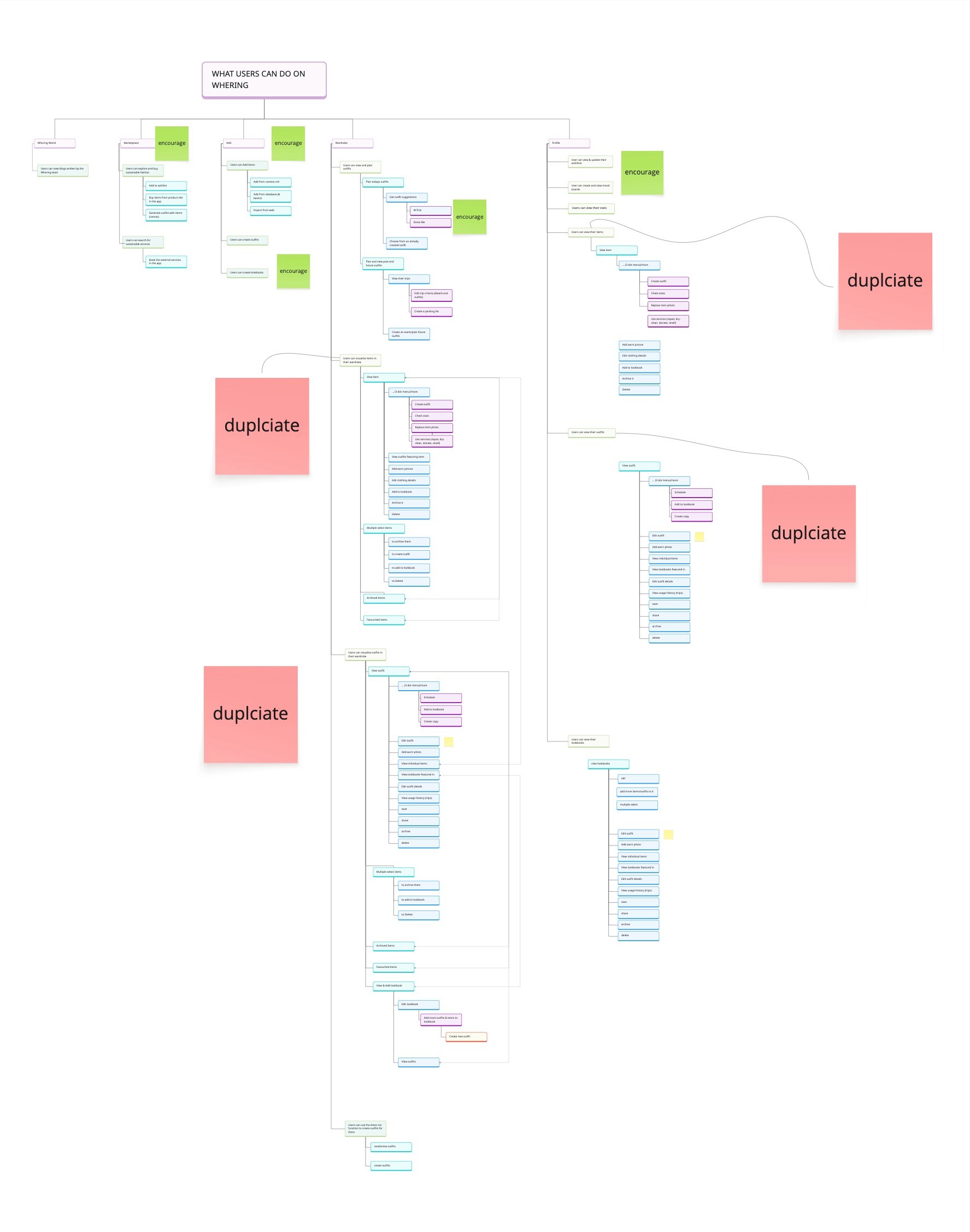
Mapping the information architecture made it clear: the issue wasn’t the individual screens, it was the structure connecting them. This clarity became our foundation.

Ideation: Restructuring Whering
I focused the redesign on the environment level, rather than the screens in isolation; asking the question, how do groups of features support users goals?
Original Structure
Profile: Wishlist & Moodboard Management, Secondary Wardrobe Management
Planner + Wardrobe + Dress Me: Wardrobe Management, Outfit Planning and Generation
Add: Modal overlay for adding Items, Outfits and Lookbooks
Marketplace: Pre-Loved Fashion Hub
Thoughts: Whering Articles (environment later became Social)
The environment structure layout mixed workflows and disconnected actions, creating cognitive friction. For example, users frequently asked “how do I add items?”, the CTA existed right in the middle, but as a modal, the action it lacked a clear place to live.

Redesigned Environments
The first step was to define logical groupings, as some environments were overloaded while others were underutilised.
I curated an initial set of environments and led a card sorting workshop with the UI Designer and Product Manager, to find the the best fit for purpose.
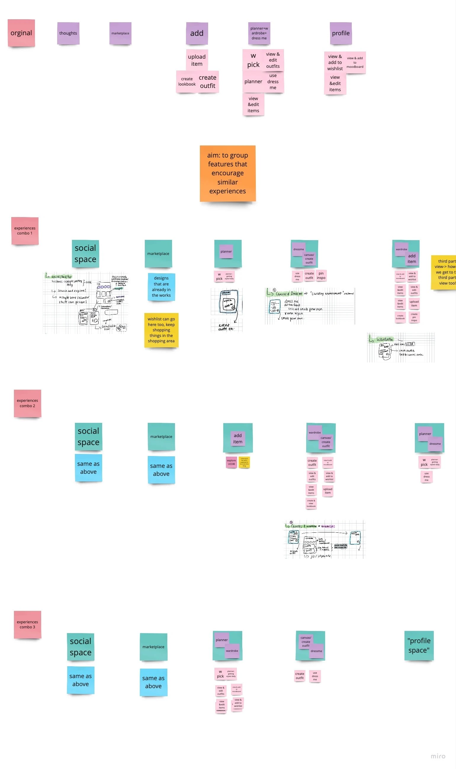

The final navigation environments balanced user needs, business priorities, and cognitive clarity:
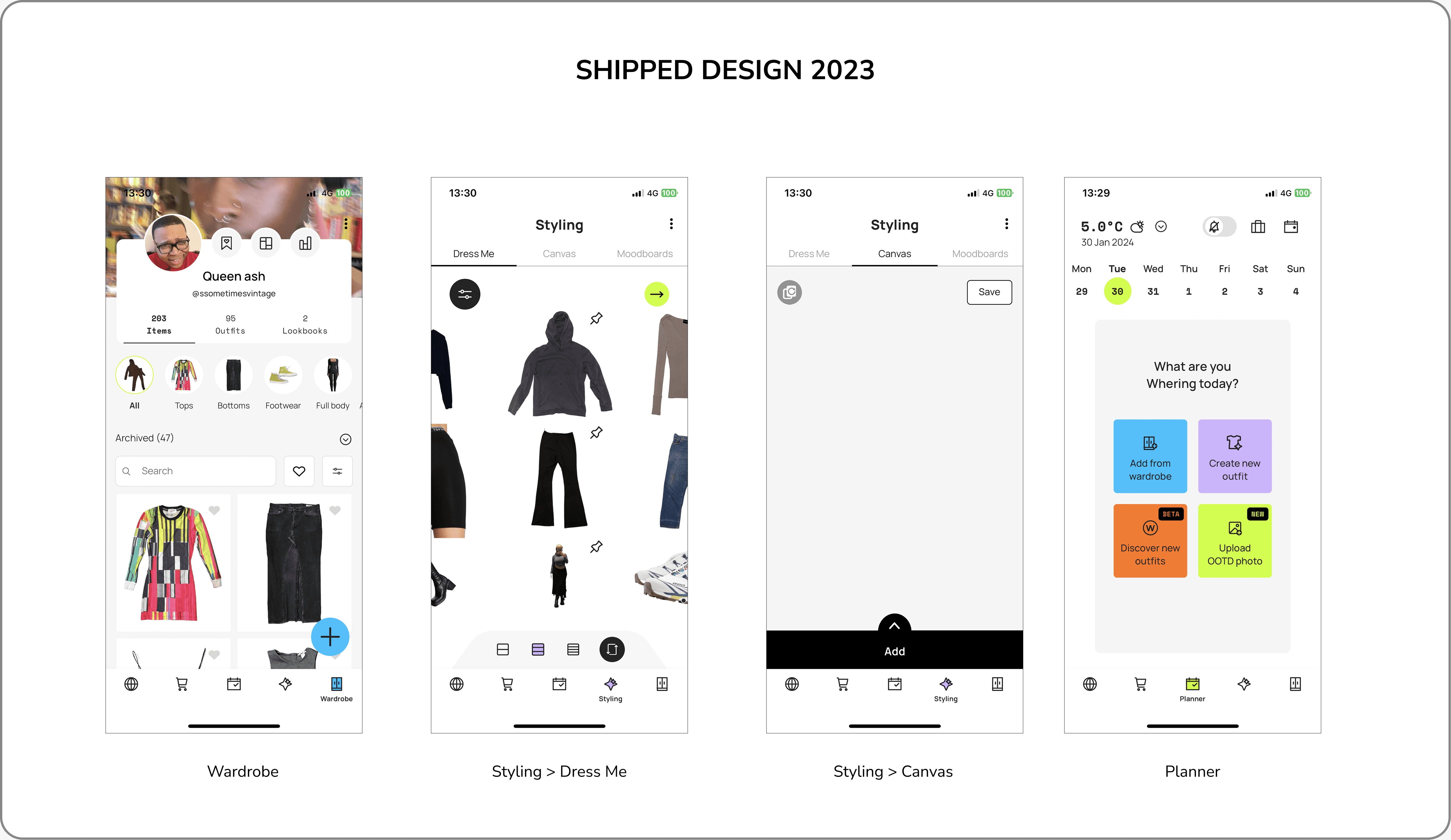
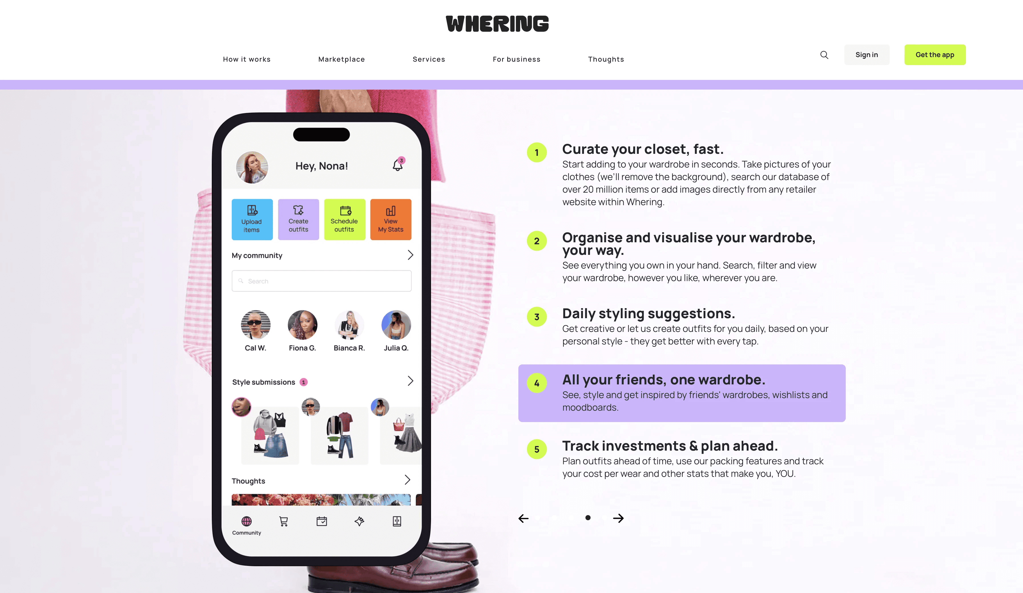
Wardrobe: Central hub for managing personal content and adding new Items, Outfits, or Lookbooks.
Styling: Dedicated to creation (Canvas, Dress Me, Moodboards).
Planner: Isolated for planning, reducing cognitive load.
Marketplace: Pre- loved Fashion Hub
Thoughts (Repurposed for Social): For sharing and inspiration.
The right-to-left navigation sequence (Manage → Style → Plan → Buy → Share) mirrors the natural flow of getting dressed: first you add items, then style them, plan outfits, shop for what’s missing, and finally share inspiration, giving each environment a clear, purposeful role.
Design: Sketching, Wireframing & Prototyping
With a clear IA and pain points defined, we began ideation with Crazy 8 sketches. The strongest concepts evolved into mid-fidelity wireframes and a working prototype.
I reviewed these collaboratively with the UI Designer and Product Manager. Team voting identified the strongest experiences, aligning us on usability and objectives before high-fidelity design.
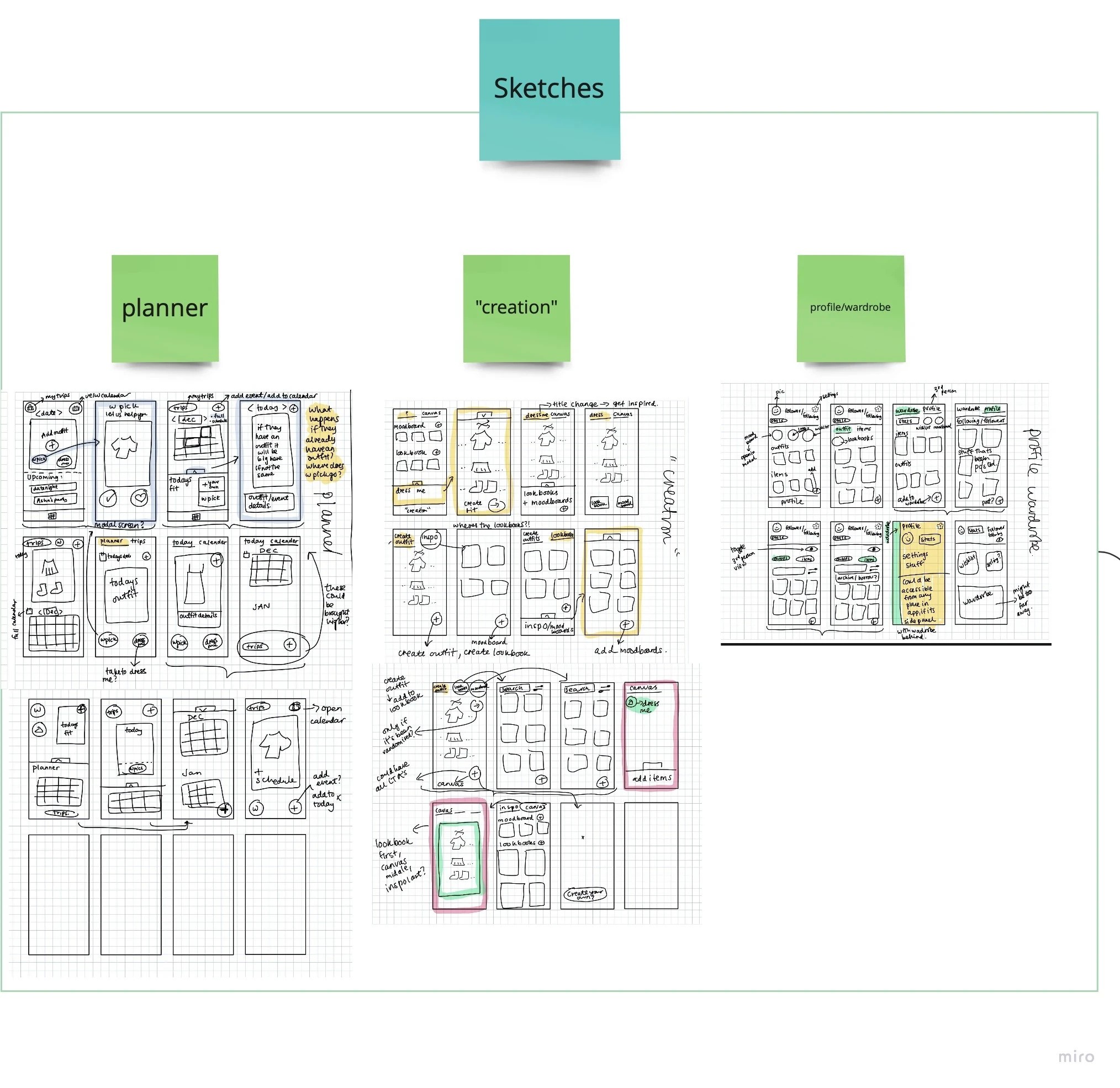
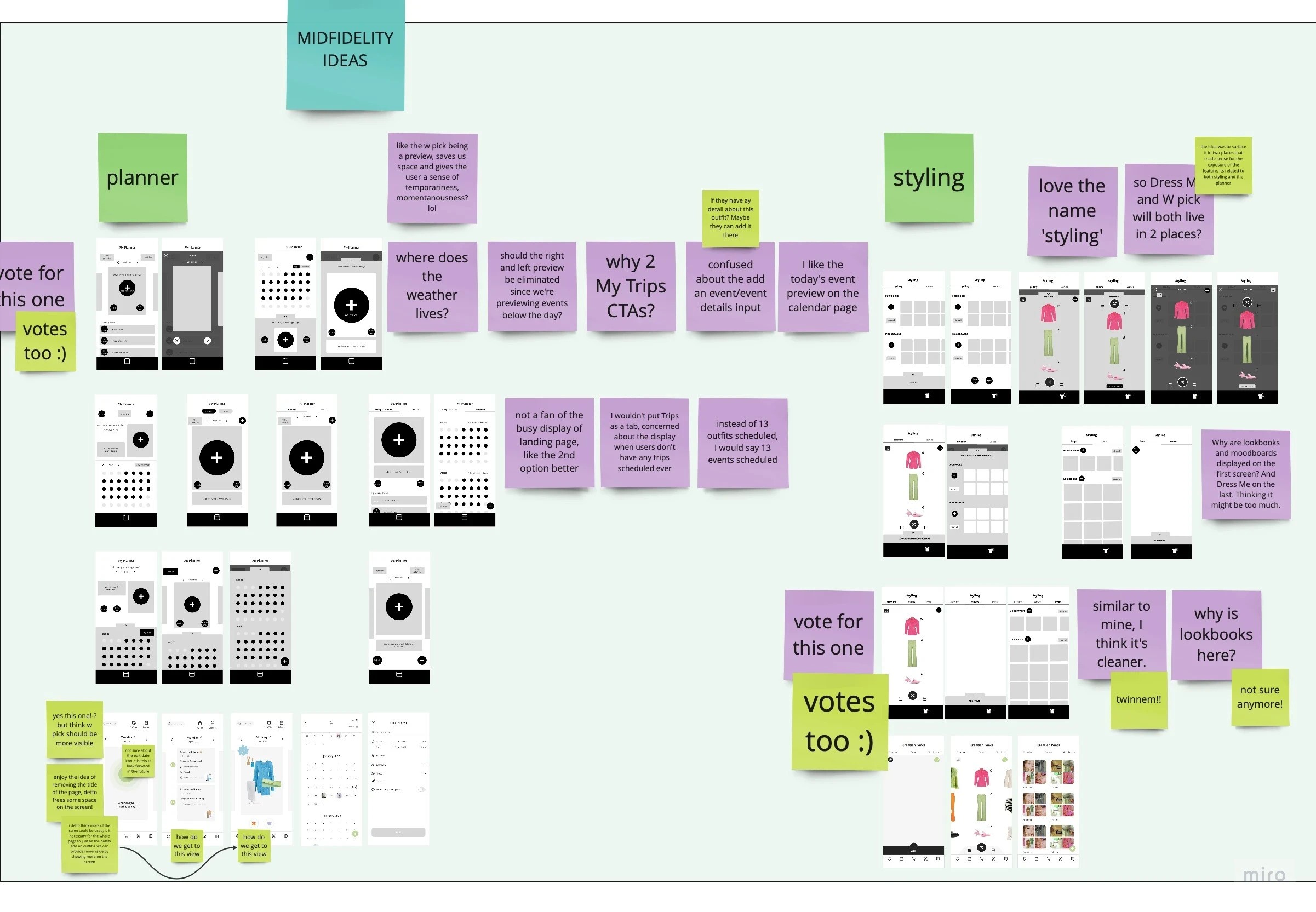
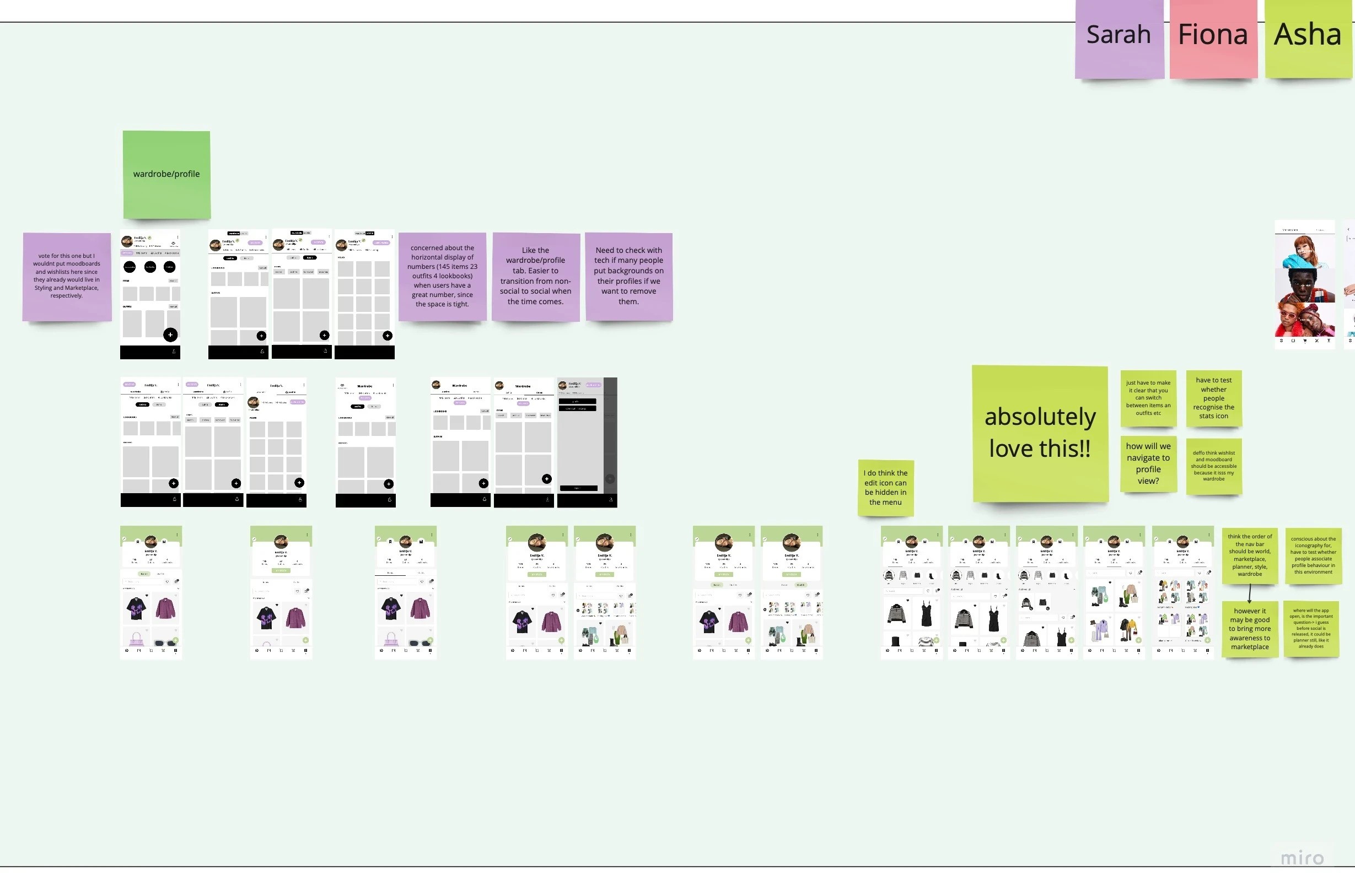
After voting, we developed a working prototype. This was a crucial step, as it allowed us to communicate the vision clearly to stakeholders and validate our assumptions through user testing.
Testing: Structure Vs Feature Clarity
To validate the new structure, I conducted a moderated cognitive walkthrough with 30 participants, observing them complete 9 key tasks.
The outcome? A 67% effortless task completion rate, confirming the new IA drastically reduced cognitive friction and made navigation intuitive.
For the remaining tasks, follow-up surveys pinpointed the issue: feature clarity, not structure. Users occasionally confused similar functions (e.g., Lookbook vs. Moodboard), letting us know that feature purposes can be further refined.
After presenting the findings, the wider team was confident in the direction and moved forward with implementation.

The Transformation
Redesigning Whering fundamentally reshaped how the app worked and how users moved through it. The biggest shift was reorganising features into clear, cohesive environments that followed a logical flow:
Old structure
Profile (View Outfits • View Items • Manage Moodboards)
My Wardrobe (Planner • Wardrobe (Manage Outfits, Manage Items) • Dress Me)
Add Modal (Items, Outfits (Canvas), Lookbooks)
Marketplace
Social
→ New structure
Wardrobe (View and Manage Wardrobe)
Styling (Dress Me • Canvas • Moodboards)
Planner
Marketplace
Social
In summary, the restructure achieved its goal: it simplified navigation, reduced friction, and established a scalable foundation by giving every feature a logical home.


Key Insights
This phase reinforced core principles:
IA is the foundation of a mobile product. Clear environments make features instantly understandable.
Features must live where users expect them, creating instinctive navigation and reducing friction.
Investing early in IA pays off, saving time, effort, and rework later.
Mental models matter. In an ideal world, a cognitive walkthrough of the original app would have benchmarked bottlenecks upfront. Our timeline meant we traded that depth for momentum, validating and refining the new mental model through prototypes instead.
This phase didn’t just improve Whering; it set the structural foundation the product would continue to grow from, which became essential as we moved into the next challenge: designing Social.
Discovery: Defining Social with the Kano Model
With the core app restructured, Phase 2 focused on defining Whering’s social experience.
The navigation already had a space called “Thoughts”; a placeholder for Social that currently housed articles, but users didn’t engage with it meaningfully. While “engage with friends” was the clear user desire, the provisional roadmap listed 18 potential features to fulfil it. Launching all at once would create a messy, unfocused experience.
My task was to prioritise: which features would make “engage with friends” feel valuable and intentional, while integrating them seamlessly into the new architecture
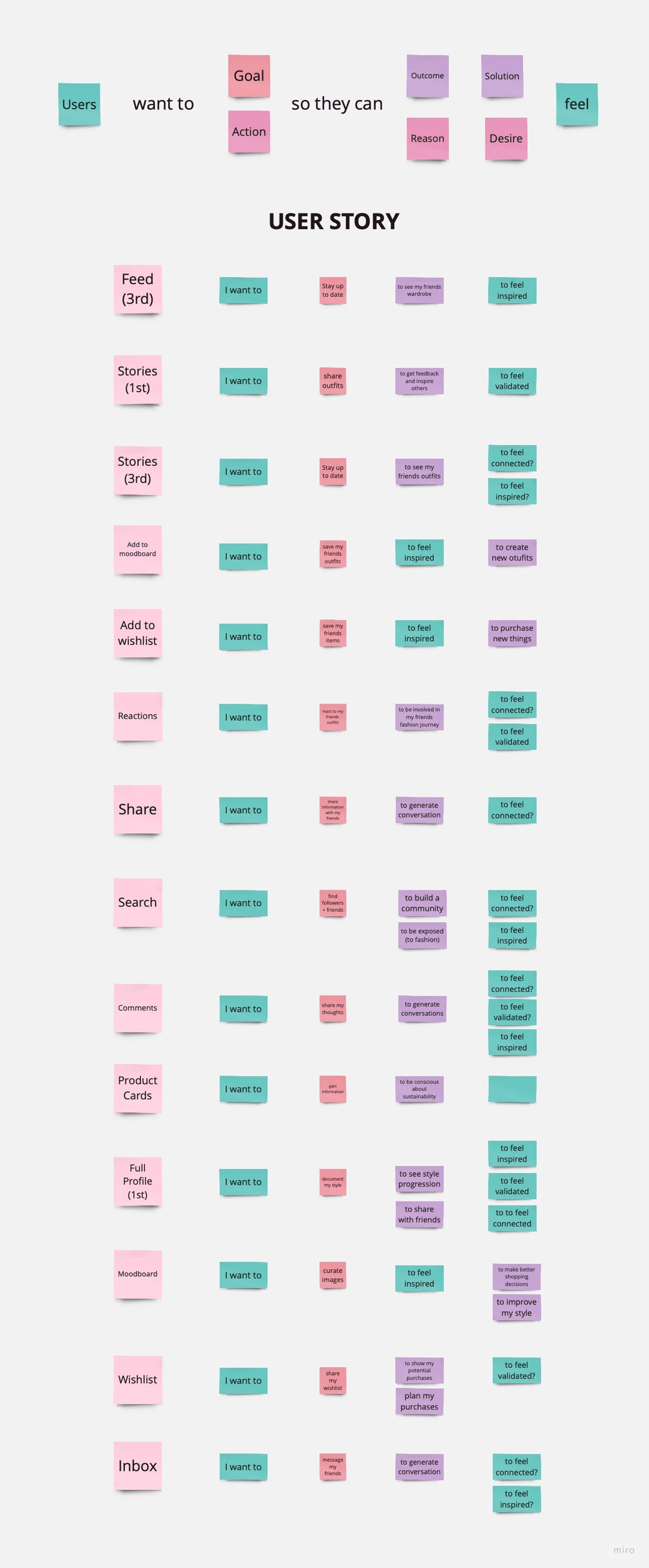
I started by analysing user feedback and emotional motivations through user stories to define what “Whering Social” should feel like, forming the foundation for strategic prioritisation.
I applied the Kano Method with 18 users, asking the two core questions for each feature on a 5-point Likert scale:
How would you feel if this feature was included?
How would you feel if it was not included?
To interpret their responses, I used key emotional drivers - connection, validation, inspiration - synthesised from earlier research and confirmed in interviews.
The initial frequency distribution felt contradictory to these strong sentiments. With a smaller sample, raw counts weren’t clear enough.
So, I moved to a more robust analysis: calculating satisfaction coefficients. This quantified the strength of delight or frustration for each feature, providing clarity.
Plotting these on a Kano graph clearly categorised each feature:
Threshold: Must-have essentials.
Performance: The better, the happier.
Excitement: Unexpected delights.
Indifferent: Low-priority.
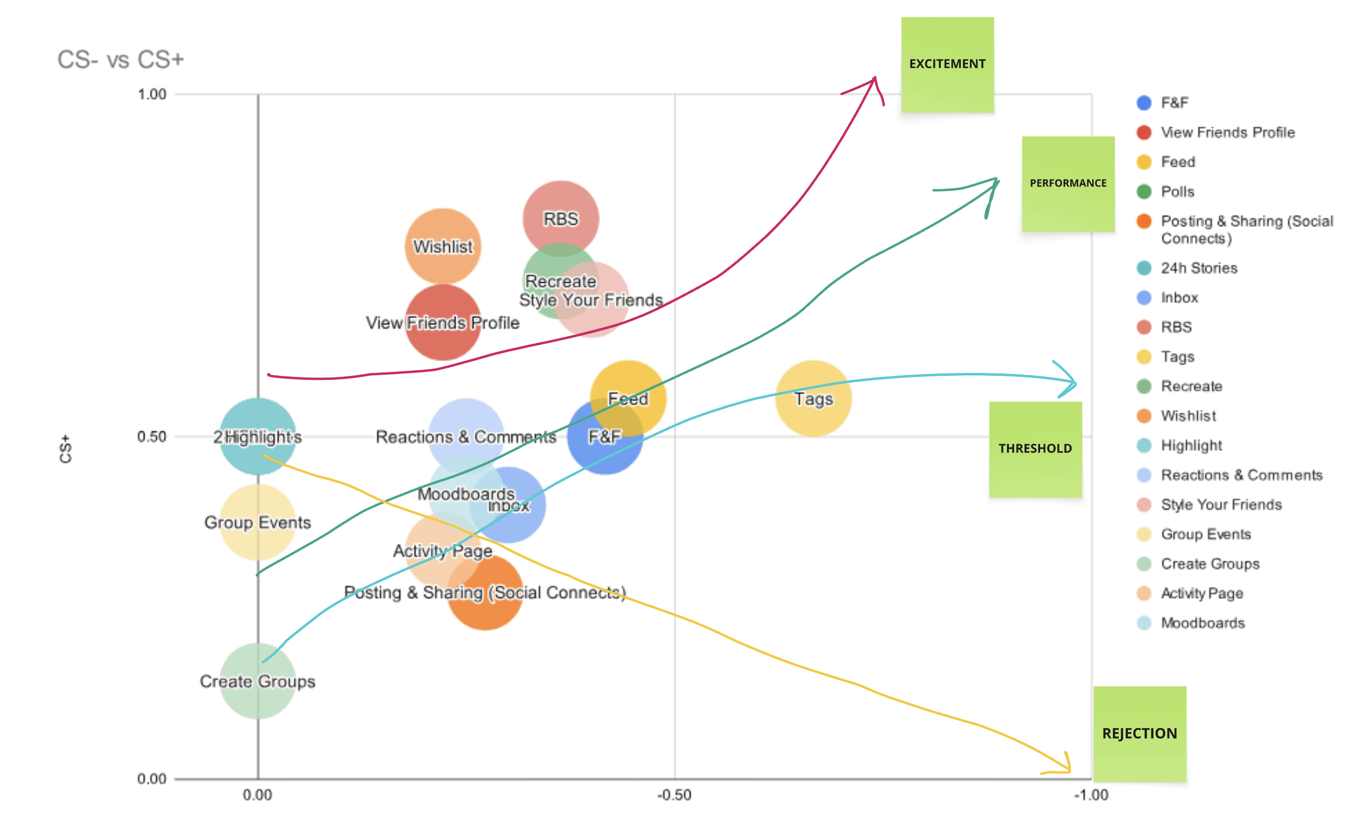
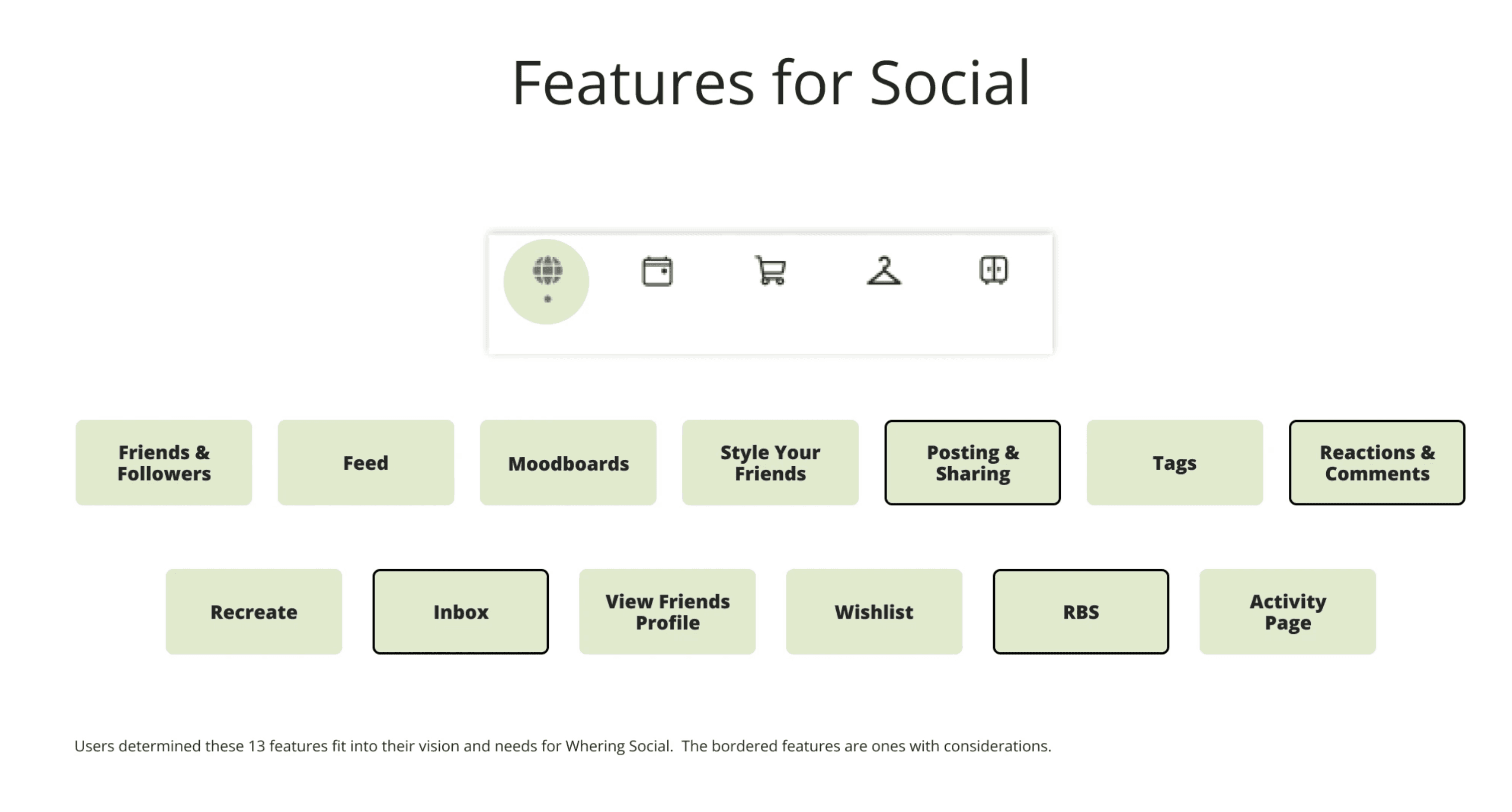
The Kano analysis gave us a clear launch list: 13 of the 18 features.
9 were user-validated features.
4 were added to align with Whering’s long-term vision for Social.
Ideation & Design
The initial Social concept was built around a feed, driven by Whering’s vision and because users explicitly expected one. Starting from early UI concepts, I built the complete feature flows (e.g connecting with and styling friends) based on Kano data, interviews, and that vision.
Every flow was designed to integrate into the new app architecture, ensuring it was useful and intuitive.
But a critical technical and UX constraint soon reshaped the entire approach...
Challenge: The Empty State Problem
The initial prototype featured a traditional feed experience. However, I realised that at launch, empty feeds would fail to engage users, there simply wouldn't be enough content.
I raised this with the product and leadership team members. The conversation made it clear: we weren't ready for a feed in version one, because it would offer an empty experience at launch, it needed content to exist first. Additionally, user interviews had flagged privacy as a major concern, which we hadn't fully addressed for a public feed.
This led to a pivotal question: How do we launch Social in a way that builds toward a feed?
My solution was to reframe Social as a new, inclusive landing page. Based on earlier research, I knew we needed to cater to socially-interested users without excluding those who weren't. I added 'redirective CTAs' (Upload, Plan, Create, Stats) for core wardrobe actions and prominently featured Find Friends, while reintegrating Thoughts for connection.
This version gave every user a clear path, whether to socialise or to manage their wardrobe, allowing engagement and content to grow organically and build the database for the future feed.

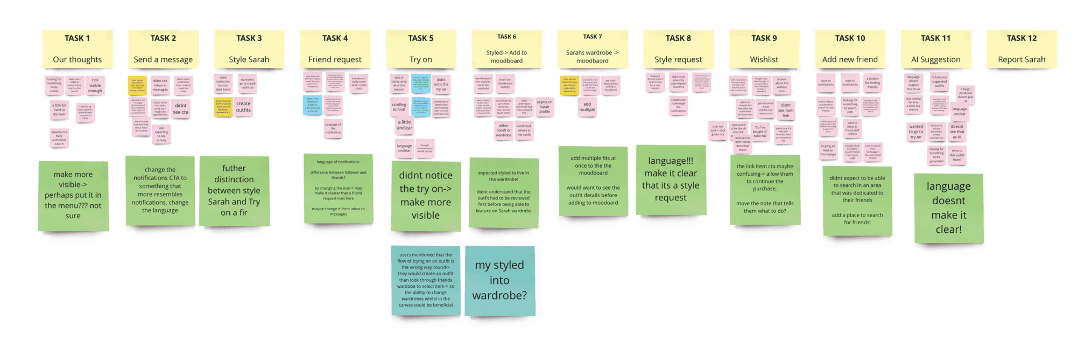
Iterative Design & Testing
I refined Whering Social through 4 rounds of usability testing with 40 participants, using cognitive walkthroughs across 12 key tasks. This was essential for a brand-new social layer, letting us see how users navigated flows, understood icons, and interacted with features.
Follow-up surveys explored social habits and privacy. A key insight emerged: users consistently emphasised that their wardrobes are personal spaces, solidifying the need for privacy controls within the social experience.
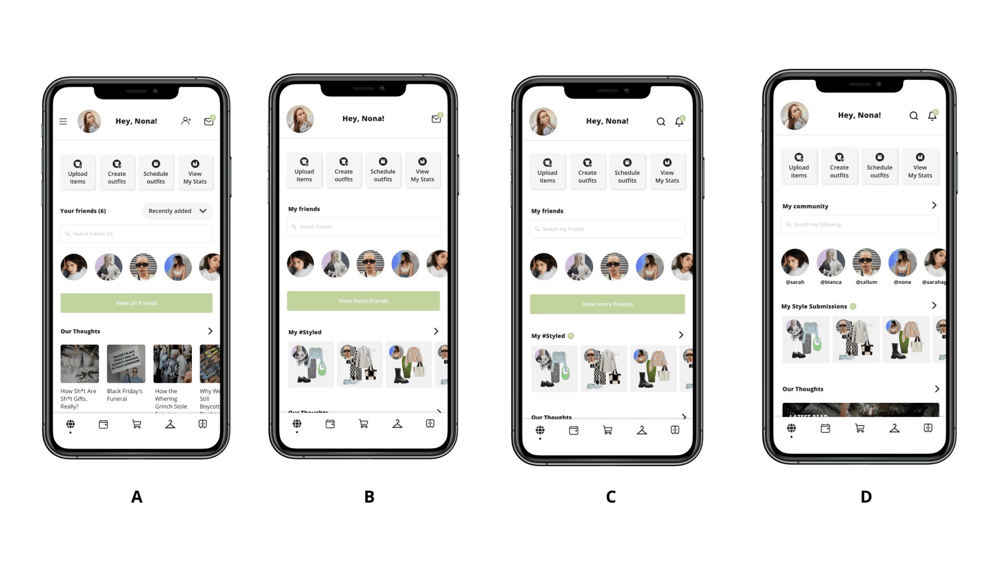
Design A (Unmoderated): Initial tests revealed mild engagement and identified areas needing simplification.
Design B (Moderated): Moving 'Styled' to a dedicated Social landing page reduced clutter. Intuitiveness rose 57% (3.8 → 5.6).
Design C (Moderated): We adjusted terminology (e.g., My Community → Following/Followers) and refined flows and clarified privacy controls, further increasing the intuitiveness score to 7.2.
Design D (Final): Final refinements to iconography, labels, and micro-interactions ensured users always knew what to do next.
This iterative, feedback-driven process resulted in a Social experience that was intuitive, engaging, and privacy-conscious, establishing the foundation for Whering Social's evolution and future roadmap!
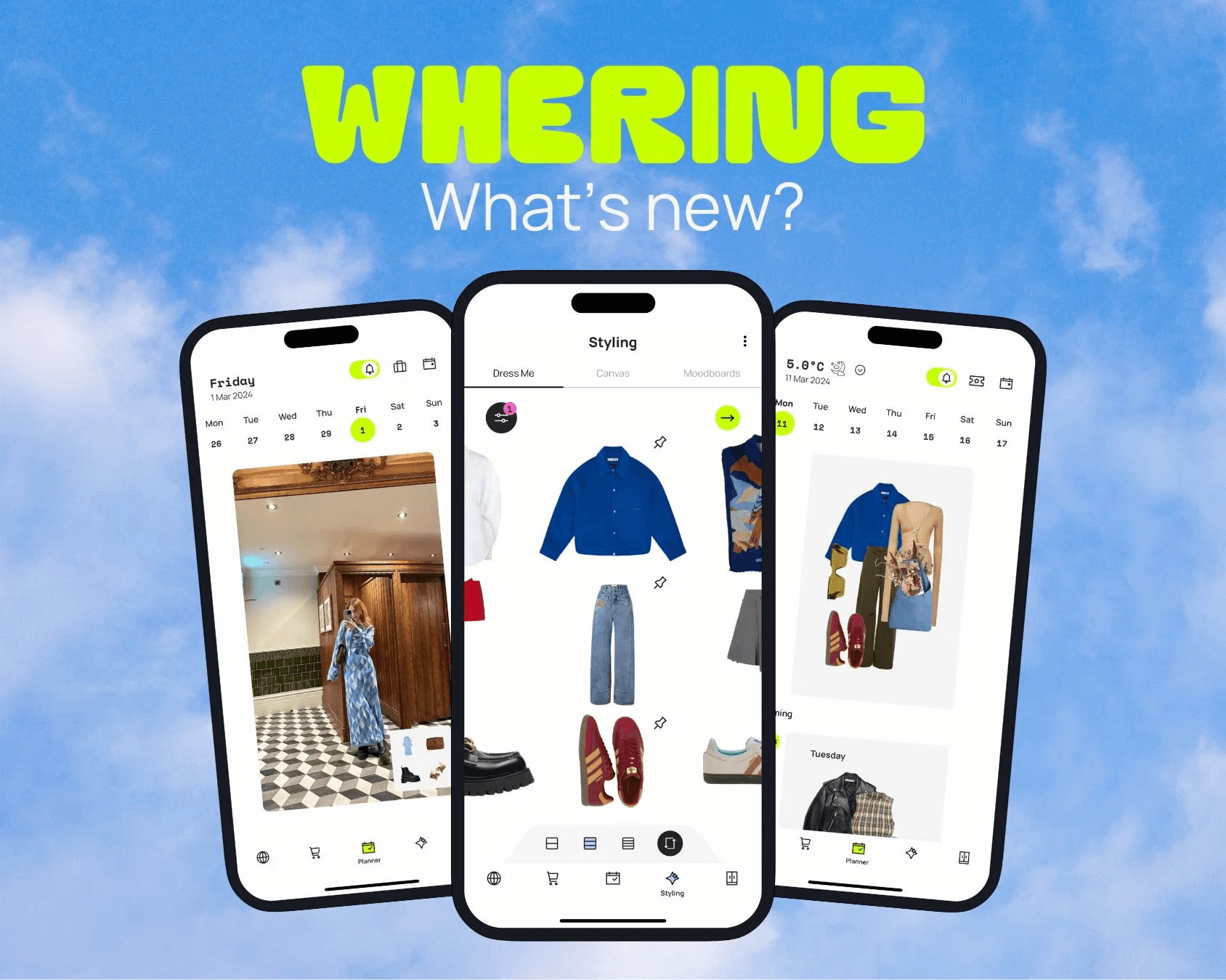
The Transformation
Seeing the early concepts, the 2023 implementation, and the current version of Whering side by side makes the evolution clear. Even as the visuals have shifted, the core structure and flow logic remain almost identical, a sign the foundations were strong and built to last.
This phase reinforced how essential user understanding is. Success came from intentionally uncovering needs, addressing privacy pains, and aligning every decision with Whering’s vision. That focus is what I believe made it resonate.
In the modern version, you can see the natural progression: the feed, once on the backlog, is now implemented, the marketplace is streamlined (simplifying the IA), and Thoughts is surfaced through the 'Redirective CTAs' I introduced, making it more visible and intentional.
A clear evolution, where the structure has simply grown with the product.

The redesigned Whering app launched in August 2023, followed by the social experience in July 2024.
The results?
+33% six-month retention and +82% audience growth by January 2025.
Over 5 million downloads, with 1 million new users in the three months after the social launch.
The work was highlighted in industry commentary as a “masterclass in UX” for its structure and skeleton (Hannah Fberg, Medium, 2024)
These outcomes prove that strategic, research-driven design is the catalyst for product transformation and sustainable growth.
Looking back, it’s incredible to see how far Whering has come, and I’m grateful to have contributed to that transformation. My journey with it started before I joined the team, I loved the app so much that I created a personal redesign and shared it with them. That initiative led directly to an opportunity to contribute as UX Lead.
Over 13 months, the redesign and social features we built helped the app evolve into a completely transformed experience. Being my first major product project, it’s rewarding to see how research-driven design solved core usability, retention, and engagement challenges.
While baseline quantitative benchmarks weren’t established at the time, but the experience shaped my approach. Today, defining clear metrics upfront is a key part of my process.
Ultimately, the project addressed the initial challenges fully. Usability, retention, and engagement issues were resolved, and a home for a thriving fashion community was established. Seeing the app described as a “UX masterclass” was a genuine point of pride. It proved that thoughtful, research-informed does not just change screen- it changes products!
Thank you so much Whering, it was an absolute pleasure to work with the team. I'm excited to see its continued growth.
Download Whering Today!
© UX Asha 2026