Boosting Customer Retention through Enhanced Reporting
As a UX Designer for Third Space Learning (TSL), I spearheaded the redesign of their teacher platform with the goal of increasing customer retention by improving the user experience. Leveraging my background as a former Maths tutor, I brought a unique perspective to the project, enabling a deep understanding of the needs of both students and educators. Through research, user testing, and design iterations, I collaborated with cross-functional teams to deliver impactful wireframes that addressed key usability challenges and aligned with stakeholder goals.
Challenges
Outdated Legacy Platform: The existing platform failed to effectively demonstrate the impact of the intervention program, which contributed to a lack of observed improvement in student performance and reduced customer retention.
Complex Platform Navigation: The inherent complexity of the platform posed navigation difficulties, necessitating a redesign to create a more intuitive and user-friendly experience.
Time and Resource Constraints: Limited time and developer availability required prioritising features for the MVP release.
Diverse User Needs: Understanding and addressing the different needs of various teacher personas required careful consideration of how the platform's reporting features could meet these diverse expectations effectively.
Design Process
Auditing the Experience
During the initial usability audit, the focus was on understanding the current state of the platform and how it compared to industry standards:
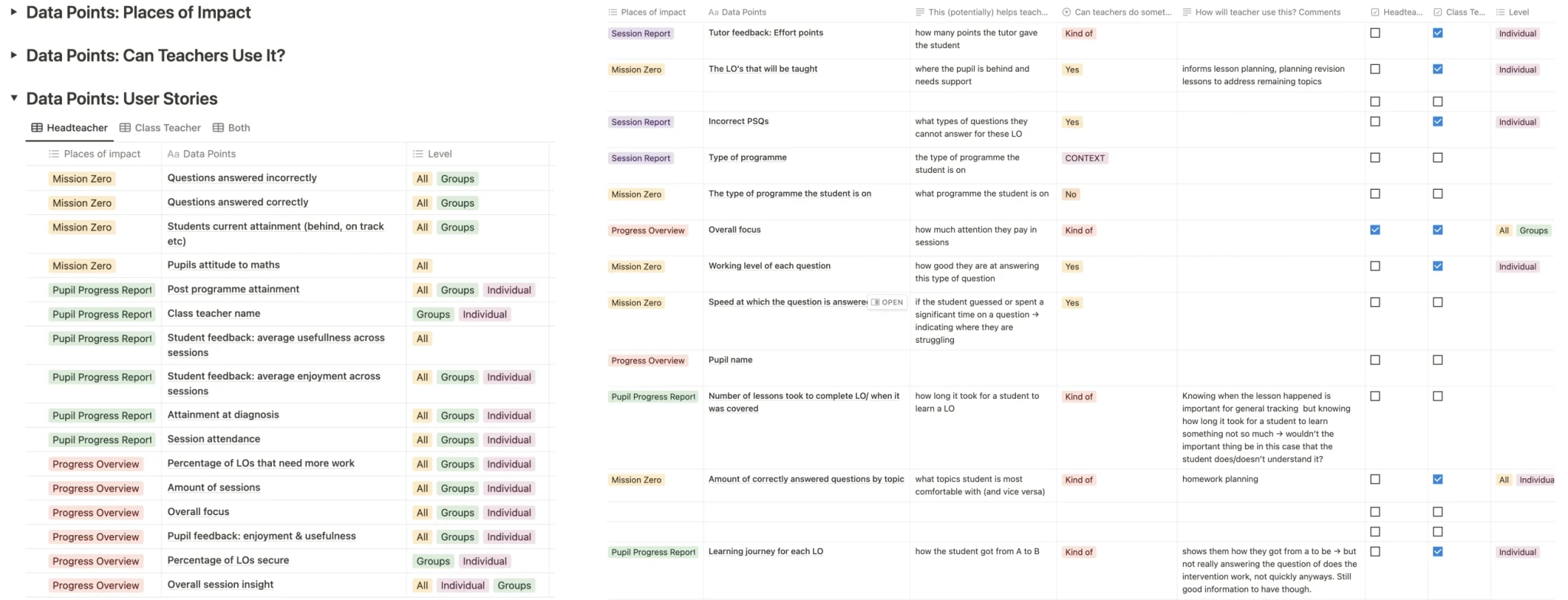
Data Point Inventory: I conducted a comprehensive audit of the data points currently available on the platform. This involved cataloging and reviewing the types of data provided to users to understand what was being offered and how it was presented.
Competitor Analysis: To contextualise our findings, I performed a competitor review to examine industry standards and practices for progress reporting. This analysis helped identify the types of data and reporting features commonly provided by similar platforms.
The goal of these generative research activities was to gather insights into what data was available and how it compared to competitors. This foundational understanding was crucial for identifying gaps and areas for potential enhancement in subsequent stages of the design process.
Understanding the Stakeholders
Two key use cases informed the initial phase of our research, leading us to form preliminary assumptions about user needs:
Use Case 1: Headteachers
Assumption: Headteachers were assumed to primarily need high-level summaries of intervention ROI for all pupils at the end of the term to review overall effectiveness and report to Senior Leadership.
Use Case 2: Class Teachers
Assumption: Class Teachers were thought to mainly use the platform to track overall student performance, with less need for detailed session-level reports.
Key Insights from User Interviews
To validate these assumptions and understand user needs, I conducted in-depth interviews with Headteachers, Deputy Headteachers, Class Teachers, Maths Leads, and Teaching Assistants. Key findings included:
Headteachers: Required detailed insights into intervention impacts and granular data to assess programme effectiveness and justify continued investment.
Class Teachers: Needed actionable, session-level reports for effective support of individual students. They had limited time for frequent platform visits, so Headteachers often reviewed the platform and shared key insights.
Definition of Impact: Users defined impact as observable changes in student attitudes, easily understandable reports, and the ability to act on identified issues quickly. They also valued the ability to share clear, data-driven insights with Senior Leadership to justify programme continuation and secure funding.
These insights led to a redesign that incorporated both high-level summaries and detailed, actionable insights. This approach ensured the platform better met the needs of both Headteachers and Class Teachers, thereby enhancing its effectiveness and ultimately boosting retention.
Organising Information:
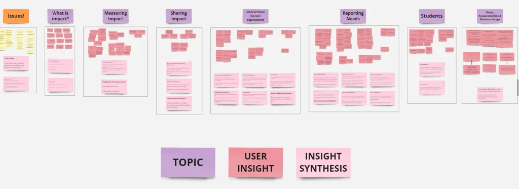
To redesign the navigation, I conducted both open and closed card sorting sessions:
Open Card Sorting: Participants grouped a list of features and tasks based on their own logic. This provided insights into how users mentally organised the content.
Closed Card Sorting: Participants placed items into predefined categories, helping validate the emerging structure.
Key Insights:
Users consistently grouped similar features together, revealing natural clusters that informed our new navigation categories.
Several features were placed in categories not initially considered, suggesting flaws in our original assumptions.
The exercise highlighted the need for clearer labelling, as some terms were misunderstood or misinterpreted by users.
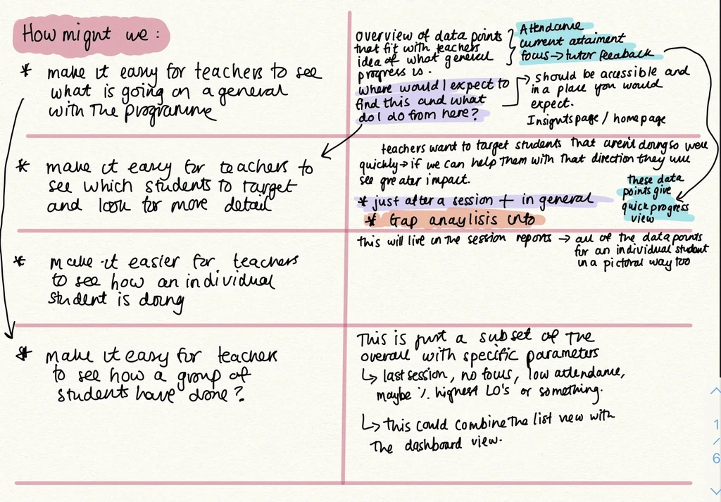
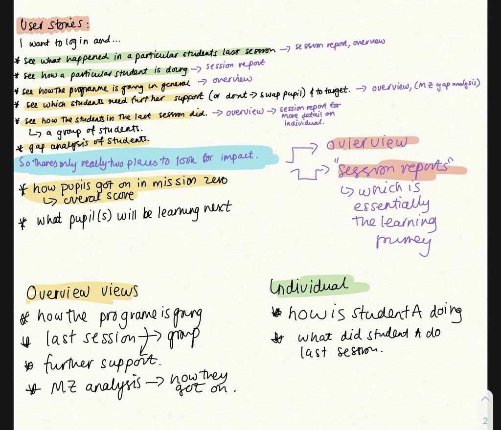
Crafting Scenarios
I focused on addressing key questions through the "How Might We" framework, which guided me in creating solutions for various reporting needs.
Specifically, I explored how to make it easy for teachers to understand overall program status, identify target students for intervention, assess individual student progress, and evaluate group performance. This process set the tone for generating ideas that would enhance the reporting experience.
Additionally, I developed user scenarios and stories to envision how these reports would provide value within the context of customer retention. By creating a clear narrative around user interactions, I gained deeper insights into the specific areas where reports could make a difference.
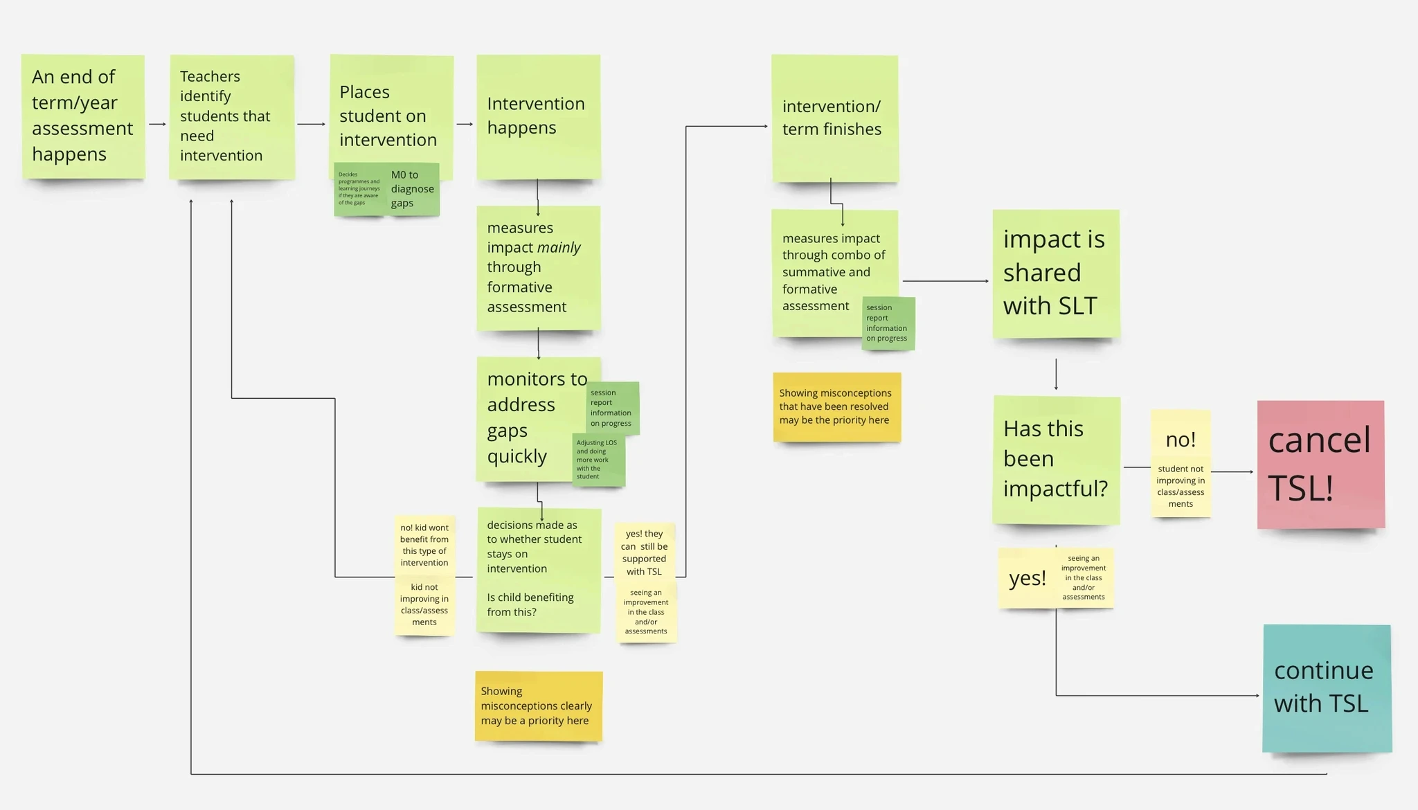
Structuring the Flow
I focused on navigation and architecture to ensure that our design seamlessly integrated with the efforts of other product teams. This approach maintained consistency and coherence across the platform, reducing user friction.
Despite the inherent complexity of TSL's platform, our goal was to create a smooth, uninterrupted user experience that aligns seamlessly with ongoing platform updates.
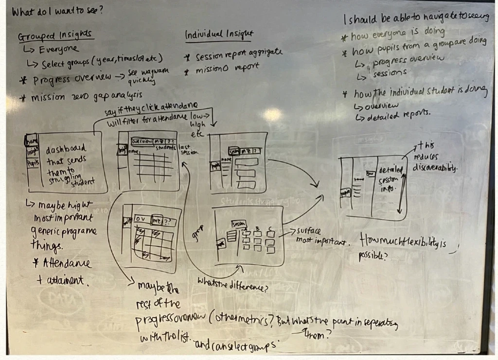
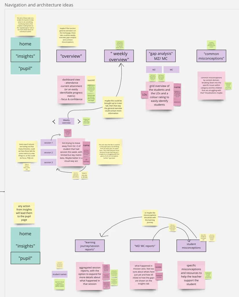
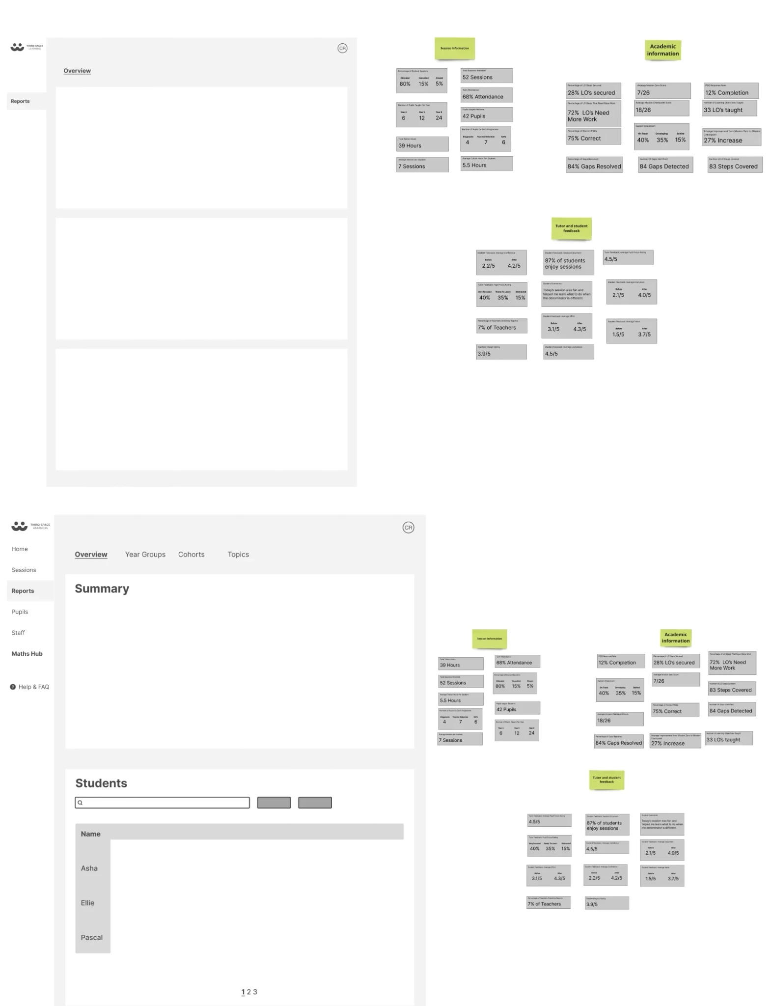
Conceptualising the Platform
I developed wireframes to address the specific needs identified:
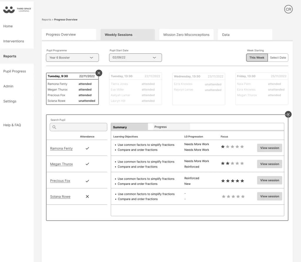
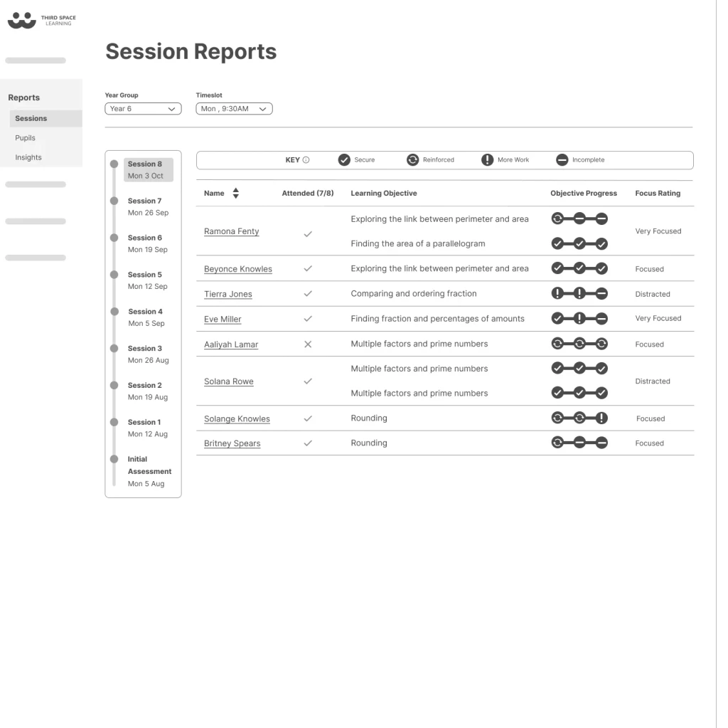
Progress Overview: Offered a snapshot of the program's status, including individual student progress over time. This helped teachers identify struggling students and provided evidence of program development for senior leadership.
Weekly Overview: Showed how specific student groups performed in recent sessions, enabling teachers to pinpoint strengths and weaknesses quickly.
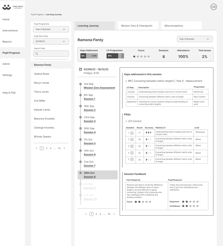
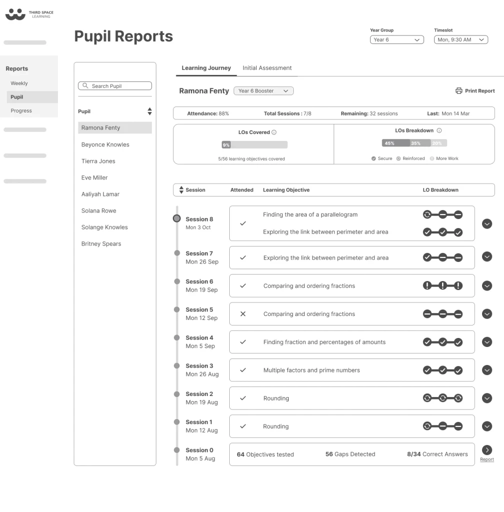
Learning Journey: Provided detailed information on individual student progress, useful for personalised support and encouragement.

Evaluating Impact
In this phase of testing our goal was to assess how teachers interacted with and understood the revamped reporting screens. Given that we were overhauling the entire platform, introducing new symbols and methods for decoding information, this phase was critical for ensuring that the changes were effective.
Overall, feedback was positive, but we encountered challenges with certain terminologies. For example, terms like ‘Gaps Addressed’ were unclear to some users without additional context. This feedback was crucial for refining the wireframes to enhance clarity and ensure that the new design effectively communicated the intended information.
By addressing these issues, we aimed to provide a seamless and intuitive user experience, crucial for the successful adoption of the revamped platform.
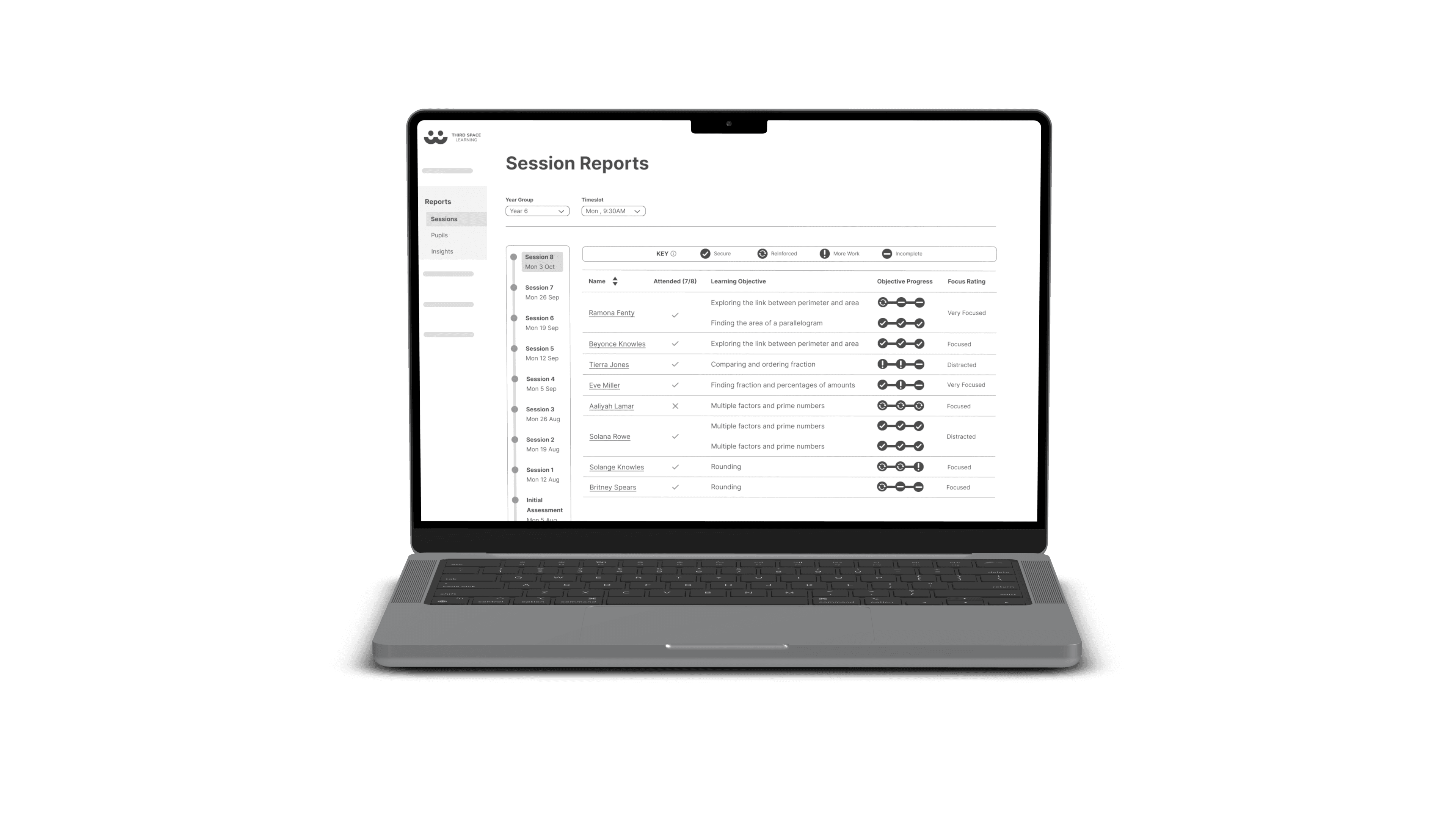
MVP Solutions
Due to developer availability and time constraints, we adjusted the wireframes to prioritize 'Session Reports' and 'Learning Journey' for the MVP release, deferring 'Progress Overview' to a future update. This choice was based on the initial data limitations and potential lack of value that 'Progress Overview' would have provided early on, which could have discouraged teachers.
This prioritisation ensured that the MVP remained both feasible and aligned with user needs. The wireframe phase, though influenced by external factors post-release, was guided by user insights and supported by rigorous testing. Our research played a crucial role in shaping a product that genuinely resonates with users.
Impact
In my role, I was instrumental in overhauling the platform’s reporting features, focusing on user experience and clarity. My work led to the successful implementation of 'Session Reports' and 'Learning Journey,' ensuring these features were both user-friendly and aligned with the platform's goals.
Key Achievements:
Improved Reporting Features: Successfully redesigned reporting interfaces to make them more intuitive and actionable for users.
User-Centric Enhancements: Addressed and resolved issues with terminology and data presentation, leading to clearer insights for users.
Effective Prioritisation: Strategically focused on delivering high-impact features within the constraints of time and resources.
Although my role was limited to this phase, the work completed has laid a strong foundation for the platform’s evolution and has had a lasting impact on its usability.