Redesigning Whering for Enhanced User Engagement
The Whering Revamp project aimed to enhance user engagement by addressing significant usability issues within the app. As the UX Lead and Product Designer, I led the redesign effort, focusing on improving navigation, simplifying user flows, and refining overall interface clarity.
The project involved analysing over 500 user reports, conducting heuristic analysis, and engaging in collaborative design workshops. The redesign introduced a more intuitive navigation structure, streamlined feature environments, and a refined user experience.
Launched in August 2023, the revamped Whering app achieved a more user-centric interface, resulting in increased user engagement, reflected in a 2x increase in outfits created and a 150% rise in items uploaded.
Challenges
Identifying Key Pain Points: The primary challenge was pinpointing the main issues causing user dissatisfaction, particularly around account deletion and app usability. This required a deep analysis of user feedback and behavior to understand the root causes.
Redesigning Complex Navigation: A major challenge was simplifying the app’s cluttered and confusing navigation structure. Ensuring that the new design was both intuitive and aligned with user needs while addressing technical constraints was crucial.
Balancing Business and User Needs: The redesign needed to reconcile user-centric improvements with business objectives, such as streamlining key features and enhancing engagement. This involved prioritizing changes that would deliver both immediate user benefits and long-term business value.
Design Process
Listening to Users
The project began with an analysis of over 500 user reports to identify key issues affecting user engagement. A significant 45% of these reports focused on 'account deletion' and 'app usability,' leading me to explore why users were opting to delete their accounts and what specific in-app actions were causing confusion.
I hypothesised that users were deleting their accounts because they couldn’t accomplish their goals due to the confusing flows within the app.

Uncovering Pain Points
Based on the initial hypotheses, I conducted a heuristic analysis, which identified a strong correlation between major UX/UI issues and user complaints. Key pain points included:
Unclear Navigation and Iconography: These were causing user uncertainty.
Overloaded Interface: Excessive CTAs cluttered the experience.
Lack of Simplicity: Too many options overwhelmed users.
Inconsistent UI Elements: These added to cognitive load and visual confusion.

Business Centred Flows
Using these insights, I focused on redesigning the navigation bar to enhance clarity, simplicity, and consistency. The review of the app’s information architecture revealed:
Cyclical Flows: Potential sources of bugs.
Underutilised and Over-utilised Spaces: Contributing to user confusion.
Repeated Environments: Also contributing to user confusion
I focused on restructuring the navigation to address usability concerns, as the navigation is the entry point to other features in the app. As well as streamlining key business focused flows such as adding items to wardrobe, adding to planner and outfit creation.

Simplified Navigation for Enhanced Usability
Recognising that the original navigation structure was cluttered and unintuitive, I took the initiative to reorganise the app's features into more intuitive environments. For example, despite the prominent placement of the "Add" button in the navigation bar, user feedback revealed that adding items to the wardrobe was the second most requested feature. This indicated that users found the process confusing and unclear, prompting the need for a more user-friendly approach.
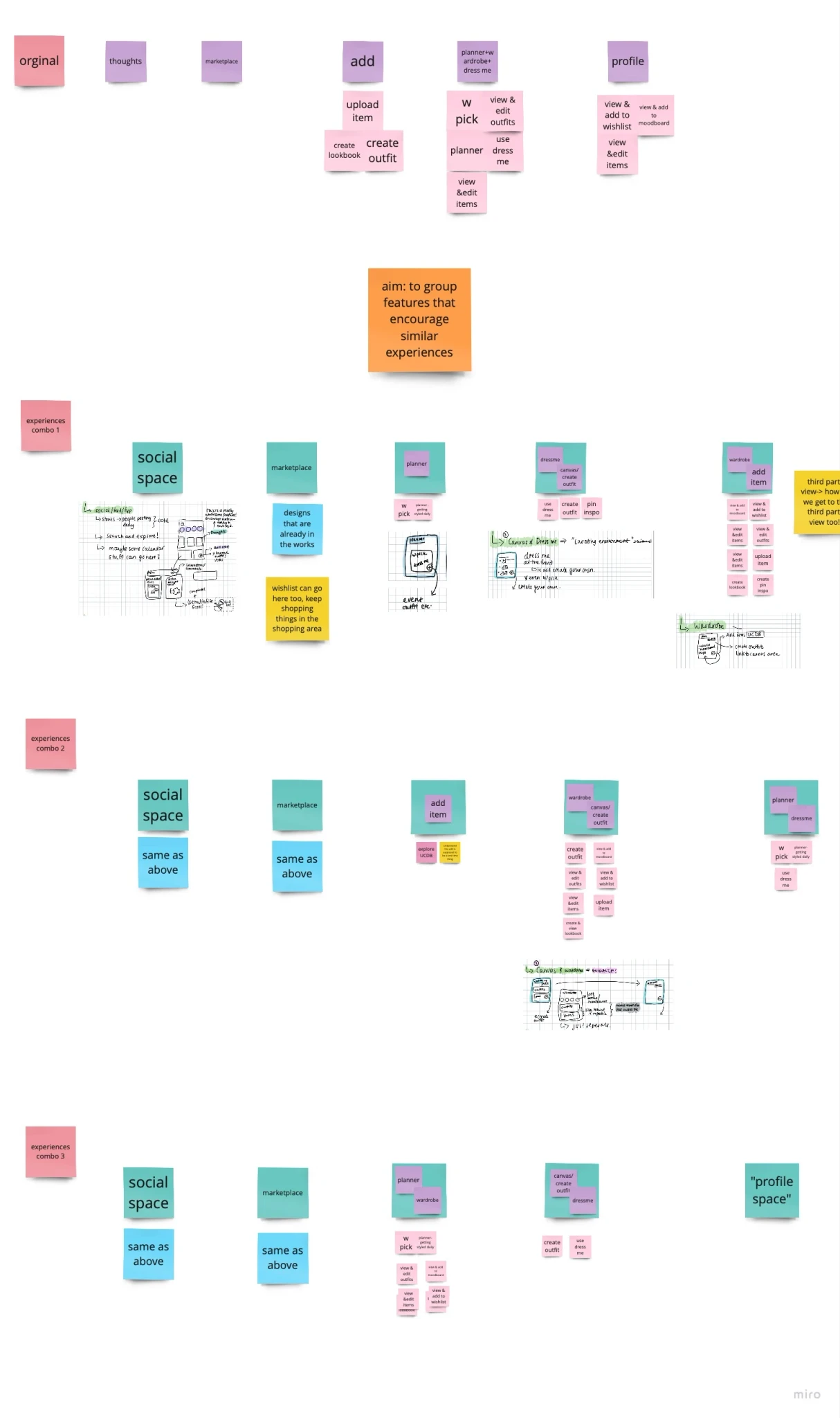
Original Structure:
Thoughts: A feature for sharing fashion ideas.
Marketplace: For browsing and purchasing items.
Add: A pop-up overlay for creating lookbooks, outfits, or adding items, but it wasn’t integrated as a distinct environment.
Planner + Wardrobe + Dress Me: A combined space for planning outfits, browsing the wardrobe, and generating outfit suggestions.
Profile: Managed Wishlist, moodboard, items, and outfits.
To address these usability issues, I restructured the navigation into distinct environments:
Redesigned Structure:
Thoughts (Later rebranded as Social): Focused on community engagement.
Marketplace: Remained streamlined for shopping.
Planner: Dedicated to planning outfits.
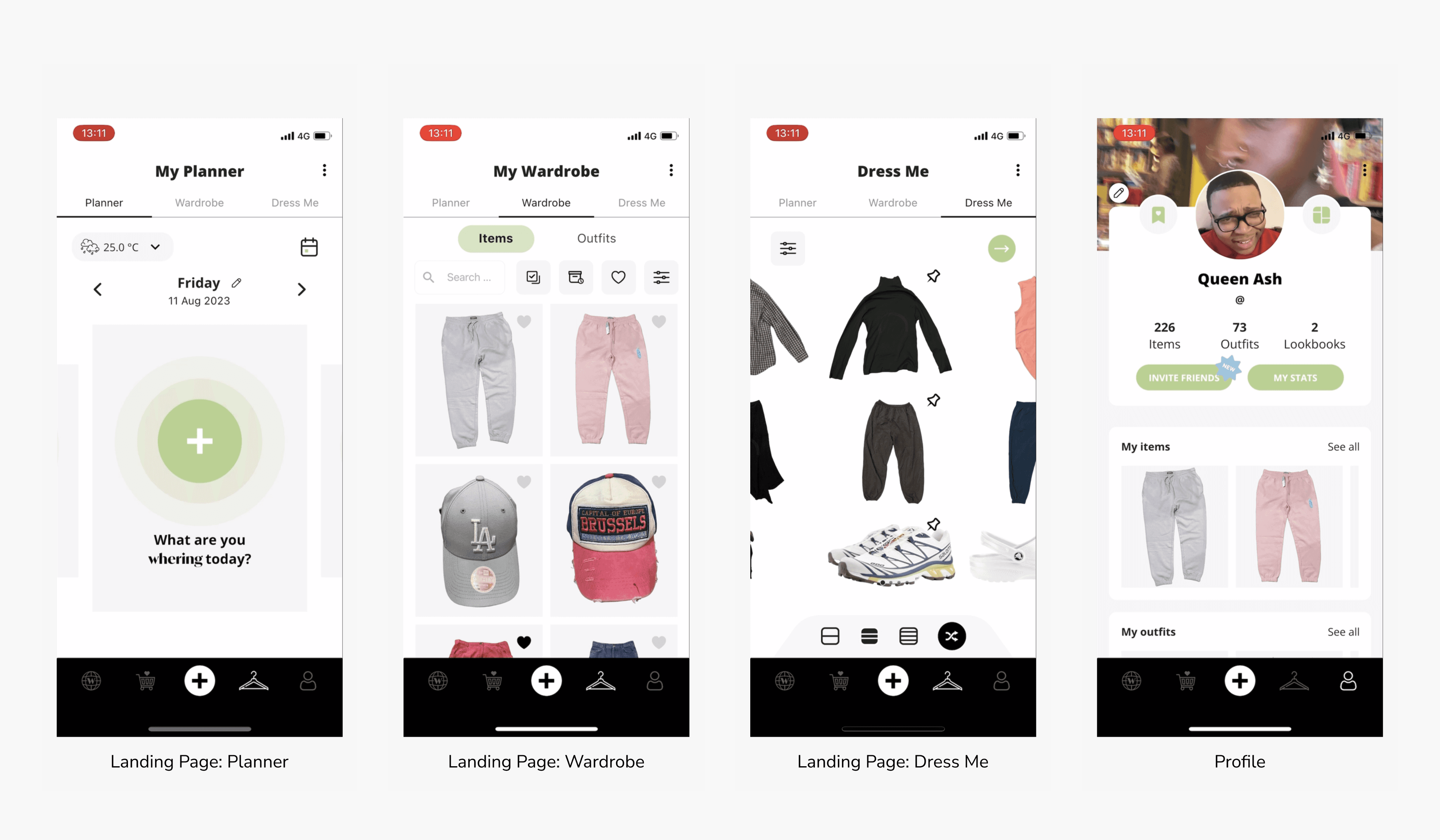
Style: Combined outfit creation, styling, lookbooks, and moodboards.
Wardrobe: Centralised wardrobe and wishlist management.
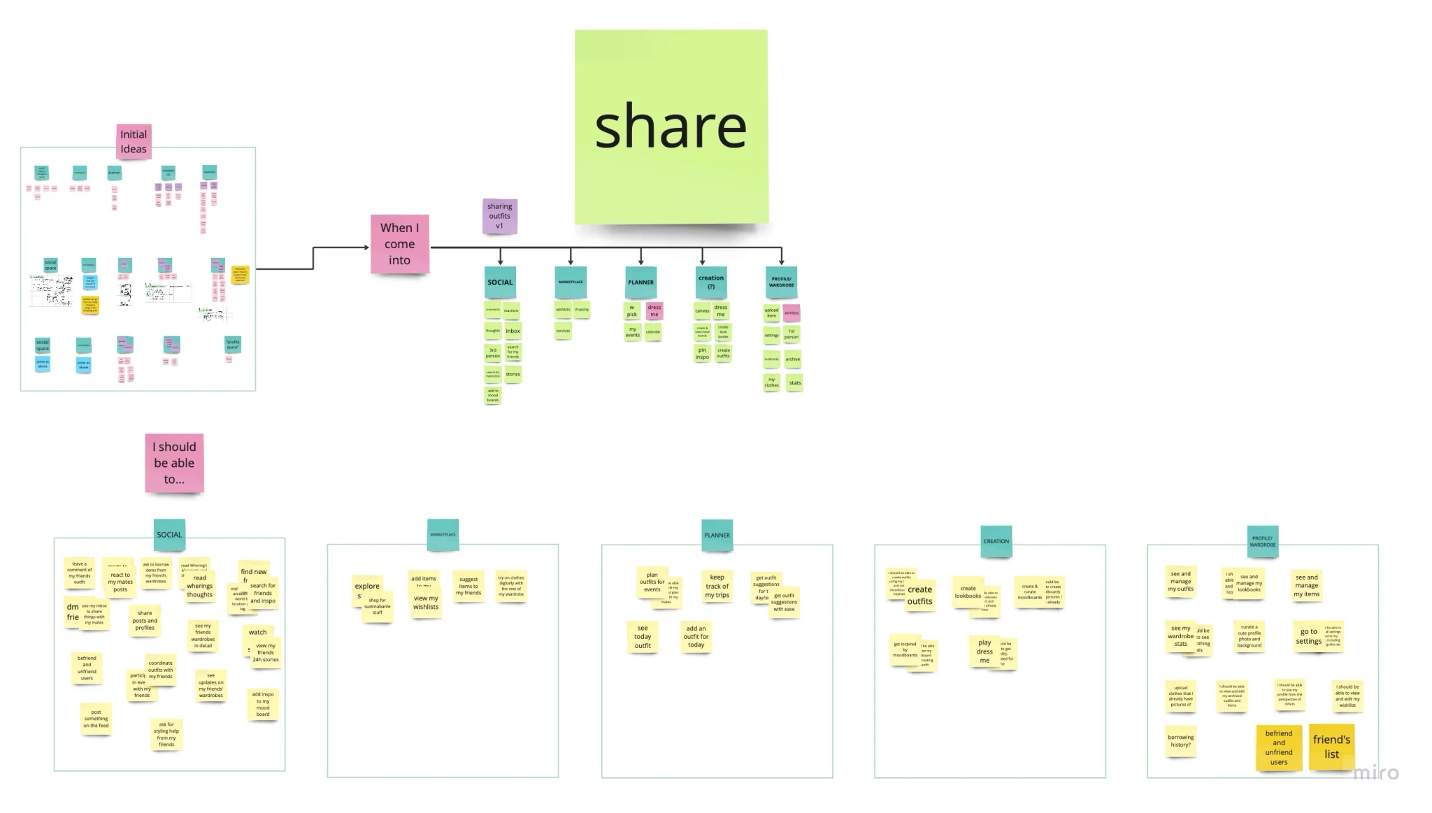
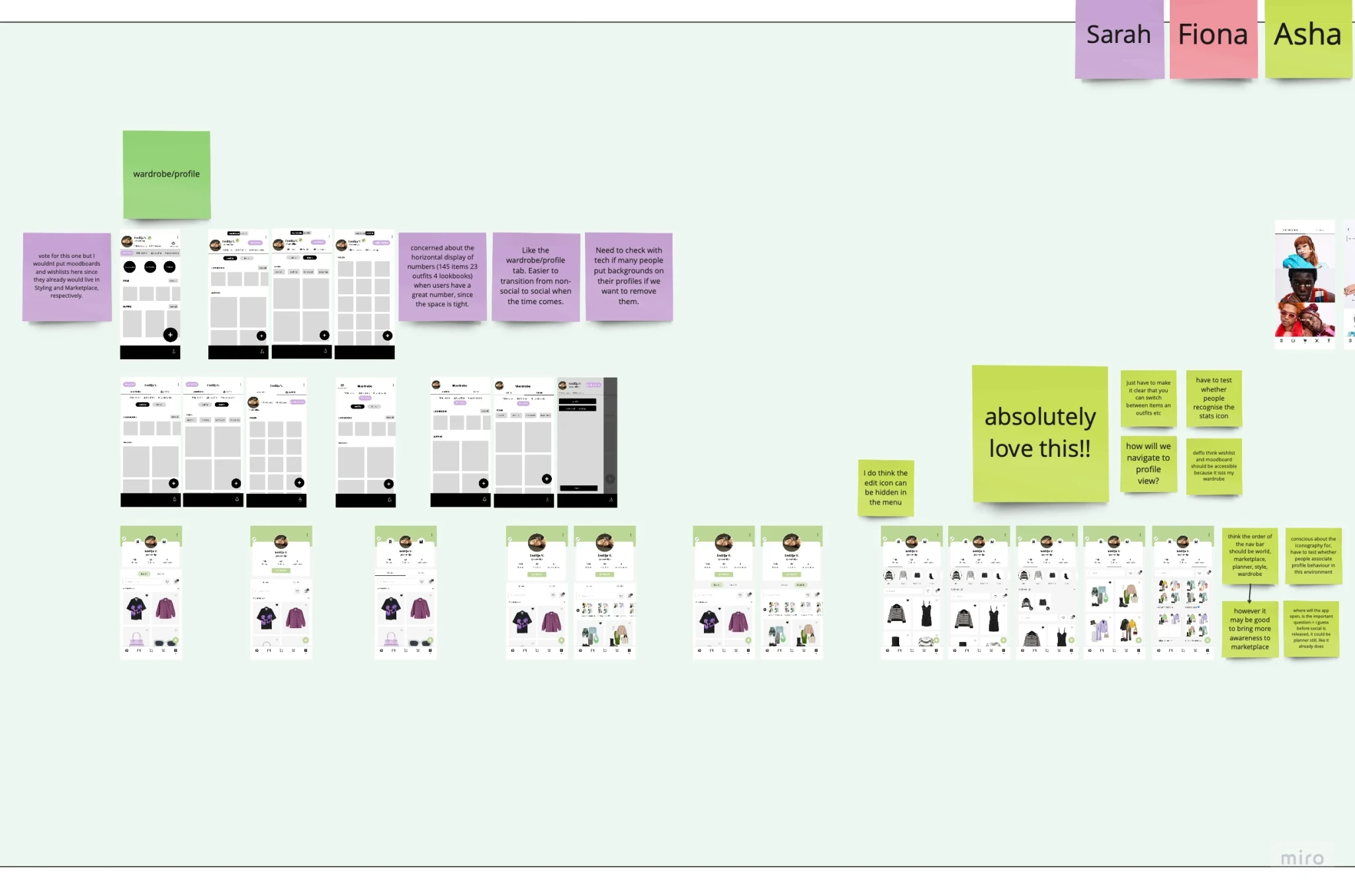
The redesign improved clarity and created a more intuitive user flow. While initially based on my observations, the changes were validated through collaborative design workshops. I led a card sorting exercise with the UX Designer and Product Manager to reorganize features based on user needs, asking, "When I come to this section, I should be able to access [feature] or complete [action]." This approach prioritised user efficiency and resulted in a simplified navigation structure.
Visualising Solutions
With a clearer understanding of user pain points and a reimagined information architecture, I used Crazy 8’s to generate numerous low-fidelity sketches for key environments: Planner, Creation, and Wardrobe.
Planner: Isolated from other features, providing a dedicated space to reduce cognitive load and simplify navigation.
Creation/Styling: Brought the "Canvas" feature to the forefront by merging it with "Dress Me," streamlining outfit creation.
Wardrobe: Centralised the wardrobe view, simplifying management tasks and aligning the "Add" functionality with wardrobe management for improved intuitiveness.
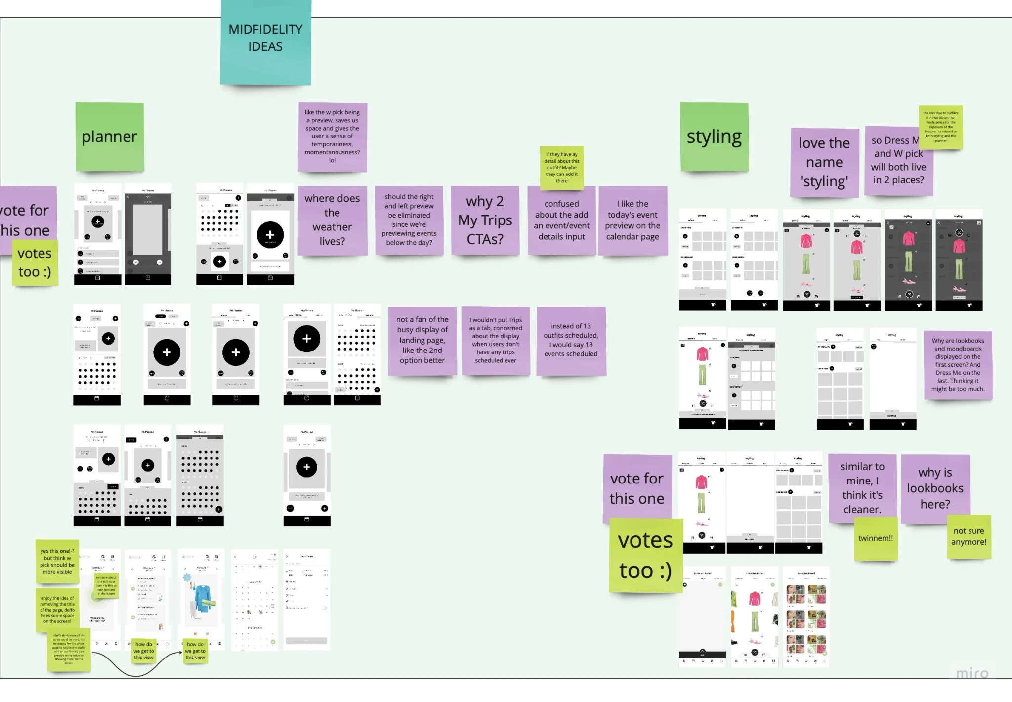
Following this, the teams UX Designer and I translated the most promising sketches into mid-fidelity wireframes. To ensure the most effective designs, I presented these wireframes to the UX Designer and Product Manager. We collectively voted on the best layouts to proceed with, ensuring the final design was user-friendly and aligned with our objectives.

Bringing Ideas to Life
With wireframes in hand, I transitioned into developing mid-fidelity prototypes that embodied the core design changes. These prototypes were essential for testing our assumptions and gathering feedback from real users. We focused on refining the navigation bar, enhancing icon clarity, and ensuring that the new user flows were intuitive and consistent across all UI elements.
Real-World Feedback

Testing was crucial for ensuring seamless navigation of the new app environments, so I conducted moderated usability tests to evaluate user interactions and identify areas for improvement.
We began with A/B Navigation Iconography Testing, where users were asked to look at each icon and describe what they thought it represented and what they would expect to find or do when interacting with it. The results showed that while 3 out of 5 icons were clear, icons A and D lacked clarity in their purpose. To maintain user familiarity, we decided to retain the original iconography for icon D, as it was more distinguishable, especially after the profile icon was revamped to represent the wardrobe.
During Usability Testing: Show & Tell Me, we observed users interacting with the prototype. The findings were promising, with 5 out of 9 tasks completed effortlessly, demonstrating the intuitive nature of the new interface. However, feedback indicated confusion between similar features, highlighting the need to clarify their distinct purposes. A supplementary survey revealed the underlying reasons for these confusions, emphasising the need for clearer purpose and more distinct design in these areas.
This phase highlighted the importance of our changes and provided valuable insights for future improvements in the app's features.


Whering 2.0!
The culmination of our efforts was the launch of Whering 2.0 in August 2023. This redesign marked a significant shift towards a more user-centric experience, driven by insights from testing and user feedback. The final design, which emerged from thorough testing with 30 participants and subsequent surveys, featured a refined navigation bar and a streamlined user flow. The focus on enhancing usability and clarity led to a cleaner, more intuitive interface, aligning with the needs and preferences identified throughout the design process.
After my design work was completed, the project was handed over to the UX Designer for implementation. The app underwent a comprehensive style revamp, underscoring the value of early research and iterative design.
Original Design
Revamped Design
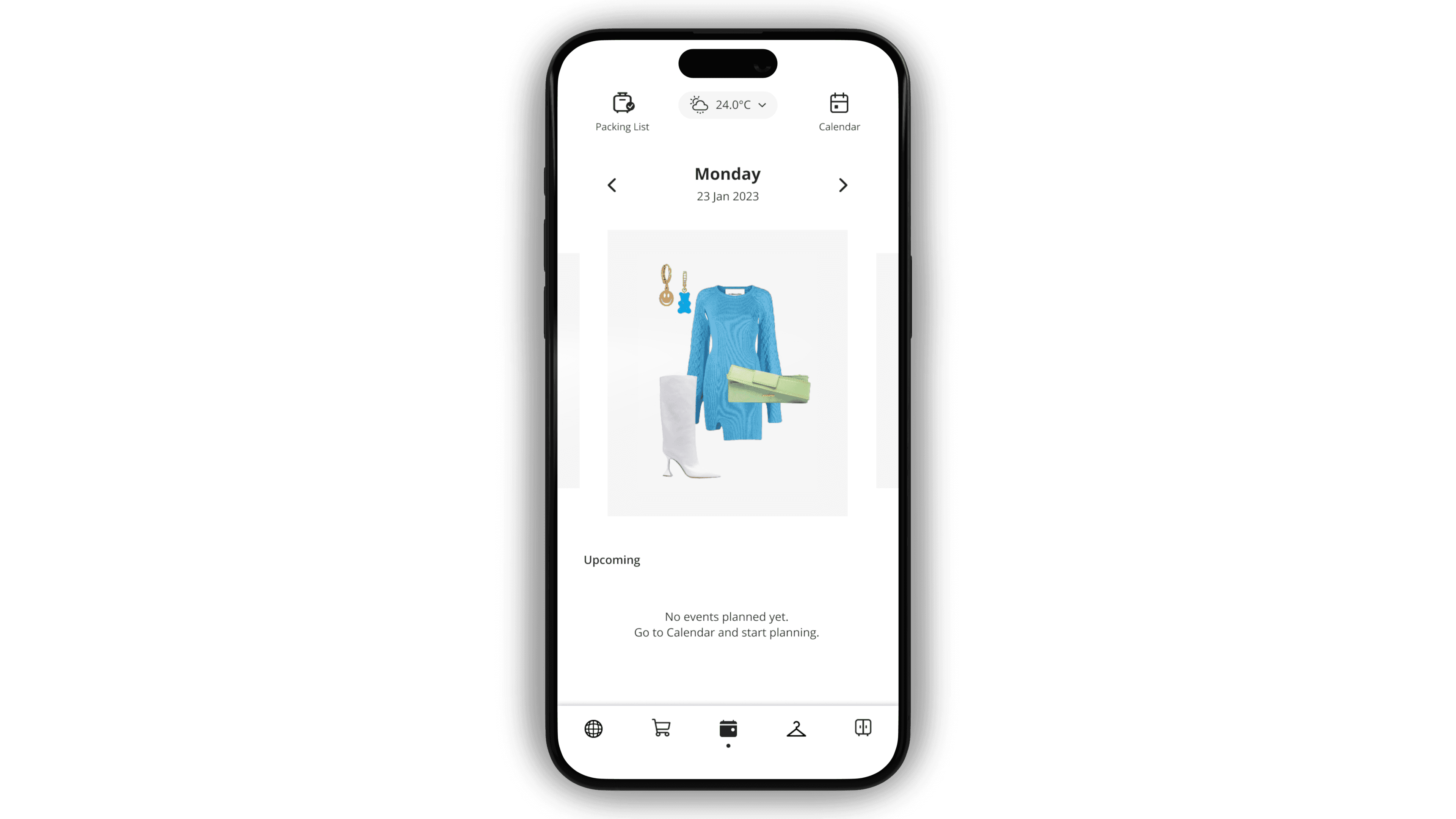
Planner: Landing Page

Styling: Dress Me

Styling: Canvas

Wardrobe

Impact
The redesigned Whering has shown promising signs of growth and user engagement.
Key indicators of success include:
A 2x increase in the number of outfits created, demonstrating enhanced engagement with the app’s features.
A 150% rise in items uploaded, indicating greater user involvement in managing their wardrobe.
A 147% increase in outfits shared on social media, reflecting the app’s improved user experience and growing appeal.
These metrics underscore the effectiveness of the redesigned interface and navigation, confirming that the design changes have significantly enhanced the overall user experience and contributed to the app’s continued growth and success.
Reflection
Working on Whering 2.0 was a rewarding experience. Identifying user issues and directly linking them to app improvements was both challenging and fulfilling. Engaging with our supportive user base and collaborating with them as stakeholders was a highlight, as it allowed us to tailor the app enhancements to their needs. This project refined my approach to UX and underscored the value of user-centered design in creating impactful solutions.
