Building Community: Elevating User Engagement with Whering Social

The Whering Social redesign brought social features to life, seamlessly weaving them into the app experience. Focused on enhancing user engagement, the project balanced innovative design with technical feasibility, resulting in a user-friendly and privacy-conscious platform that redefined Whering’s community interactions.
Challenges
Feature Prioritisation: Determining which of the 18 proposed features to include in the initial version of Whering Social was a key challenge. I needed to use a method that would help identify the features with the most potential for impact and future adoption, ensuring we focused on those that would resonate with users while aligning with the app's goals.
Maintaining Usability & Cohesion: Social features needed to integrate seamlessly into Whering’s existing design, enhancing the user experience while preserving the app’s overall functionality and simplicity.
Navigating Technical Constraints: Collaborating closely with stakeholders, including the CEO, I redefined the social landing page format after the original feed functionality was deprioritised. I introduced targeted redirection CTAs to guide users to the app's core tools, ensuring the social features remained intuitive and aligned with Whering’s broader vision.
Design Process
What Drives Wherer's? Exploring User Motivations
To understand how to enhance the app, I started by reviewing user feedback from previous research. Users had been requesting social features for some time, seeking more community interaction within the app. I explored the emotional needs these features might address, focusing on how they could improve users' experiences.
By understanding the emotions tied to these features, I could pinpoint which ones would resonate most with users, helping me shape the design direction.

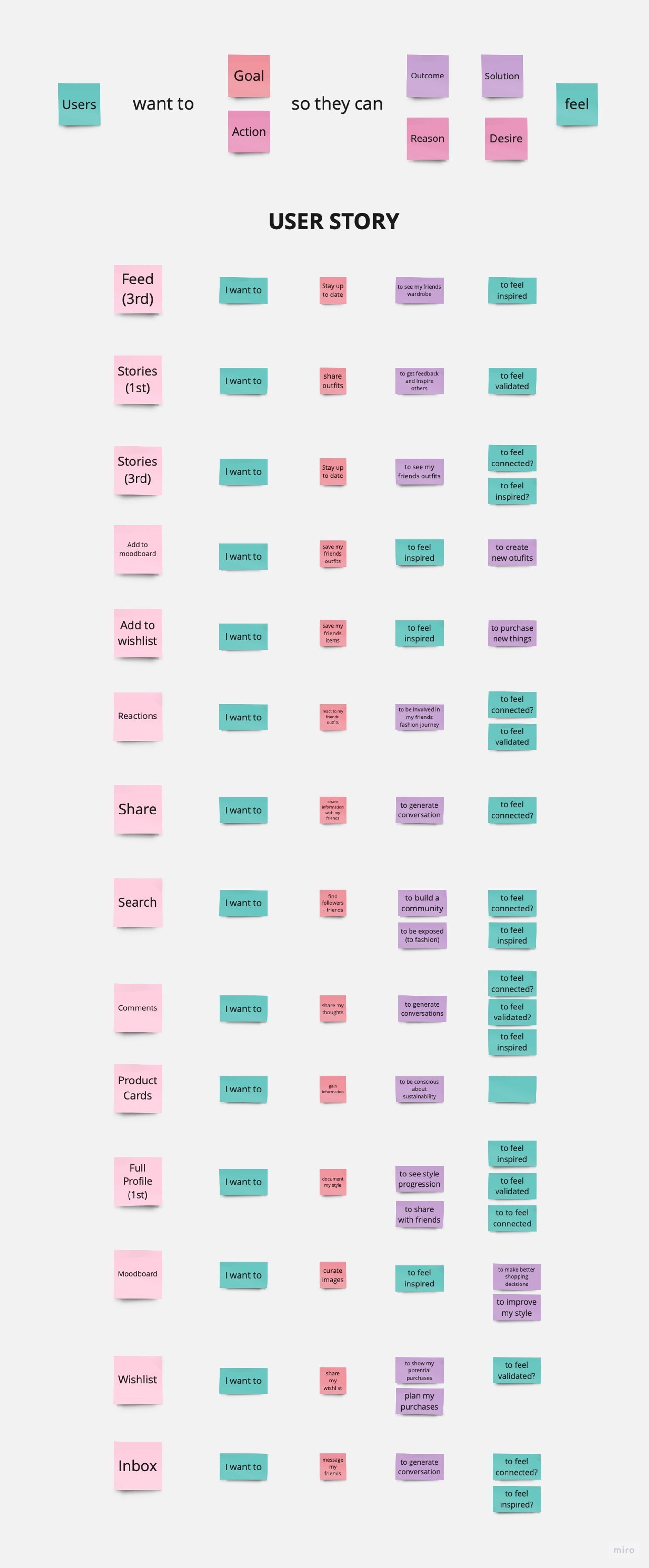

What Users Really Want: Priorities Uncovered
My goal was to understand users' expectations and their reactions to Whering’s new social features. During these interviews, I used the Kano method to prioritise features. I asked users two questions for each of the 18 proposed features:
How would you feel if this feature was included?
How would you feel if this feature was not included?
Users rated their responses on a 5-point Likert scale, which helped categorise features into groups like Attractive, Performance, and Basic. This approach helped to distinguish between must-have features and those that would enhance the user experience.

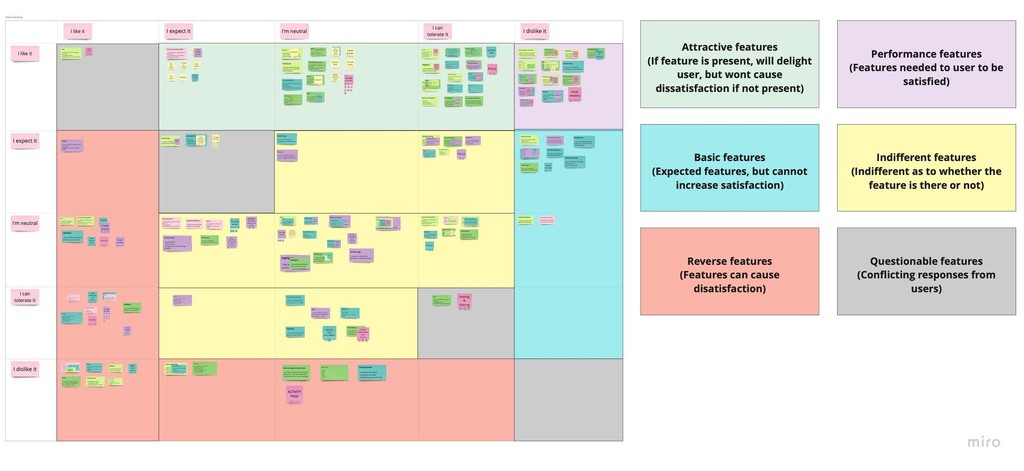
Features That Matter: Kano Analysis
User ratings varied, making it challenging to determine average placements on the Kano grid. To address this, I looked at the frequency distribution for each Kano category
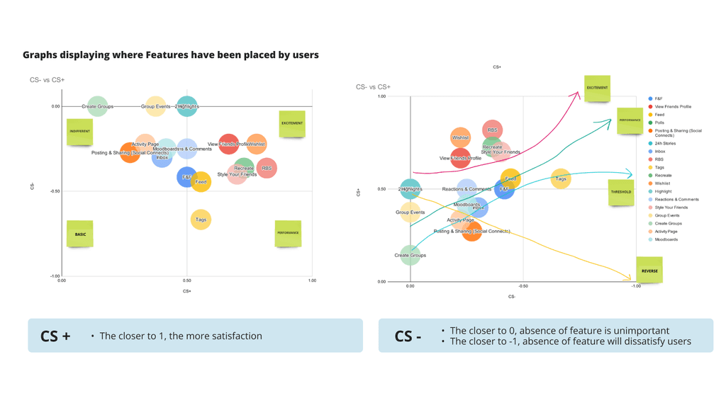
While this provided some insight, the results were inconclusive. Therefore, I conducted further analysis using customer satisfaction (CS) coefficients and mapped them on a Kano diagram to clarify feature importance. From this 13 out of 18 proposed features for implementation.


Bringing Ideas to Life: Visualising Whering Social
Building on earlier social design concepts, I crafted a refined prototype for the Social landing page. My design integrated features based on user preferences and Whering's strategic vision, aiming to enhance user engagement and overall experience.
Navigating Constraints: Creative Solutions
With the feed functionality removed from the MVP after meetings with the Whering Team, I revamped the Social landing page, adding targeted buttons for easy access to the app’s most popular tools, ensuring users could navigate easily without being forced into social engagement. This approach aligned these changes with both user preferences and Whering's broader vision.

Listening to Learn: Key Insights from Users
Four rounds of usability testing were conducted to refine Whering Social:
Design A Testing: Evaluated 7 out of 13 original social features with 14 participants through unmoderated sessions on Maze. The focus was on navigation and design intuitiveness. Results showed only mild user interest, indicating a need for further refinement to enhance engagement.
Surveys and Interviews: Conducted to gain deeper insights into users' social media habits, privacy preferences, and opinions on Whering's new social features. This research was essential in shaping subsequent iterations, particularly for addressing privacy concerns and refining the presentation of features like "Styled."

Iterating with Purpose

Based on feedback from usability testing, several design iterations were made:
Design B: The "Styled" feature, initially planned for the wardrobe section, was moved to a dedicated social landing page to avoid clutter and preserve the personal nature of the wardrobe. This change, along with other design adjustments, led to a 57% increase in intuitiveness ratings compared to Design A, and user ratings for social engagement improved from 3.8 to 5.6.
Design C: To reduce confusion between "Friends" and "Followers," the term was updated to "My Community," which included both friends (mutual followers) and followers. However, to align with standard social media terminology, the final design reverted to "Following" and "Followers." This change, coupled with enhanced privacy controls, addressed user concerns about managing their personal wardrobes and viewing permissions.
Design D: The final iteration saw improvements in text, iconography, and feature placement. The "Wishlist" flow was refined to clarify that reserving an item required a separate purchase action. These updates improved the app’s intuitiveness and overall user-friendliness.
Welcome to Whering Social!
The final version of Whering Social, Design D, was the result of extensive testing and iteration. It streamlined key features, improved intuitiveness, and ensured that users had clear, easy access to privacy settings. The user flow was aligned with both user needs and Whering’s broader vision.
Once completed, the design was handed off to the development team for integration, ensuring that the social features were seamlessly embedded into the existing app.
Style Friends Flow


Style Submission Flow


Wishlist Flow


Impact
Whering Social was successfully launched in July 2024, closely following the logic and user flows developed during the design process. While the final product incorporated new branding and stylistic updates due to a rebrand, these changes did not alter the core functionalities or user journey. The alignment between the handoff and the live product highlights the lasting impact of the design decisions made during the project.
The successful launch of Whering Social demonstrates the strength and adaptability of the design work completed. The user flows and feature prioritisation, which were critical to the project, were retained in the live version, validating the thorough research and iterative design process.
Additionally, positive user feedback on the App Store has highlighted the impact of the redesign, particularly in enhancing user engagement and overall satisfaction. These reviews serve as a testament to the success of the project, with users praising the new social features and improved usability.
Reflection:
Leading the design of Whering Social was a deeply rewarding experience that challenged me to think strategically and collaboratively. Redefining the social page format pushed me to align design decisions with both user needs and business goals. Collaborating directly with the CEO gave me a unique opportunity to influence the product vision, and seeing my ideas come to life in the live app was both surreal and satisfying.


